Saturday, 30 December 2017

Extended Practice- Study task 1- Extended Brief- Initial Interior Layout

Extended Brief- 

Initial Interior Layout 

After looking at shops and looking at what I would need to show, I designed a few sketches on the layout of the shop. This is also going on the already built furniture that I have for this animation. After adding colour for easier understanding, I was really drawn to the idea of having an upper level to the shop which meant the one on the bottom left was my preferred initial design.


This is a more professional design of of what the layout might look like after more extensive research. The upper level is more of a library and scroll area, and the lower to be filled with more random items the father Allbright has collected over the years. This is obviously after the change of story idea to be more than just clocks, to more bits and bobs of whatever he's found of interests, which is why it is called an Emporium.


These sketches below are very quick designs for the top two and a more quick detailed, digital sketch for the bottom design. They are so I can show the interior layout, think about shot angles, colour scale as well as lighting studies. So they are going to be very useful once done in full to show the audience what I was planning and how they were used in the final animation.


Thursday, 28 December 2017

Extended Practice- Study task 1- Extended Brief- Initial Character Designs

Extended Brief- 

Initial Character Designs

When starting out the character ideas, I was imagining the main character to be an elderly man as they alone create sympathy when sad. Yet I then added a daughter, so the male needed to be her dad, and therefore more middle aged than older. I needed to then look at who the character was and who he needed to be. Many different personality traits needed to come across, as well as him being a fatherly figure. This was so he could still draw in the audience and make them feel for what is happening in the story, that his shop is losing all of its business.

These are the character idea boards that helped gain a better vision of who needed to be built.

Father&Daughter


These are the characters that I designed when exploring what made a father figure and kind look for his face. This was very difficult because I had never tied a character like this before and it still needs work on making him memorable as well as the perfect main character for the audience to see and watch for most of the animation. 

Character Necessities:
I know he needs glasses, this is because he has been working in low light working on very small objects his whole life. That repetitive eye strain is what caused his eyes to grow worse. He also needs to look tired. This is because in Victorian times it was harder to live and make a living. His long hours within the shop have aged him and left him tired, yet still loving what he does as it is something he is good at and was passed down to him from his father. 

(Have references in the shop to the shop being passed down)

This is why more time needs to be spent on designing the character because of how important he is and how much he is prominent within the animation, so the audience must love him.

Thursday, 14 December 2017

Extended Practice- Study task 1- Extended Brief- Feedback so far

Extended Brief- 

Presentation & Feedback so Far 

After producing work for this presentation, I was able to show more of the story and intent of this animation. After the last presentation the animation story was a little unclear so showing the storyboarding drafts let my peers understand my animation and what I am trying to show with the story. This is why for this presentation, colour pallet, storyboarding, character mood boards and shop front designs helped peers see my vision of a 3 minute animation.

One of the main points made was the street. I was struggling with the scale of this as it needed to be a whole street, yet it was suggested that I could do one long strip and shoot the three shops on either side separately so they look like they would be opposite to each other. By doing this I don't have to worry about building a whole street and beyond, they would be straight shots or slightly tilted for depth, showing the scene to be larger than it is.

Another good point risen was the ending, i was struggling with where the story was going to end so it is still something to work on, but it was said that I could make the neighbour more popular but he is alone, therefore the main character have each other even if money is sometimes an issue. This is where the story of family comes into it and draws in the audience as it is a single dad and his young daughter. 

I will also have to figure out how the set will be build too, the sides need to open so I can move the camera to different angles, as well as getting in to easily move the characters about. This is always difficult so making it easier in any way would make a big different overall when trying to do a full 3 minute animation. 

I have also been wanting to create a logo/ name for the animation, this is o it can be recognised by a name and therefore easier to find when online, as well as easier to explain as the title should hold meaning to what the animation is about. This is something I have never done so would be good to produce as it can also lend to creating business cards.

Overall this process was useful in giving me a direction to head in the module, what needs attention and what I need to get going with. 

Monday, 11 December 2017

Extended Practice- Study Task 3 - Projection Mapping Christmas Brief 4

Study Task 3 - Projection Mapping Christmas Brief 4

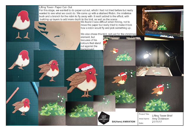
Here is the process of building the robin animation, as well as filming, and how it was done. This was my first paper-cut animation so it was great to see how it is done, as what stages need to be done to get to the filming stage.

We went for a cartoon style bird which I think was a great choice as it made him look more appealing and cuter for a Christmass animation that was being shown to all ages.
This was the first animation after I put all of the images together on premier and exported it. As you can see it is way too slow and the colours dont stand out enough, which is a crucial thing for it to show up on the dark building.

Here is the second animation, which plays faster and looks more appealing as the lighting and contrast have been turned up. I make it brighter because of the building, so I really hope I have been able to edit this enough for it to be seen by the audience that it is being shown to, as we are both proud of this short but effective animation. I am also proud as I have now done a paper cut-out animation.

Friday, 1 December 2017

Extended Practice- Study task 1- Extended Brief- Shop front detail sketches

Extended Brief- 

Shop Front Sketches

When deciding upon the Victorian era and style, I had to look into the shop fronts that existed in that time. As my character is a shop owner this meant it had to be clearly a shop with obvious features for the audience to be able to see what my character does and the contents of the shop.