Monday, 25 January 2016

Visual Language- Study Task 2 - Captain Character- Rendered character

Rendered Character and Colour Concepts

This is my digitally drawn character that i have done to test out different colours schemes for her so i can see which one i would like for the final outcome. I really liked showing what my character would look like fully finished with different colour designs so i have shown 4 colour variations. This really let me see the possibilities of what i could do for my final design.

I also did the key next to it so if i were to come back to this page to animate, theres a colour pallet to go from so they can see which ones are the correct shade so each slide will be correct. As i went though this process, i found other colours i could use in the future that work really well but i went for the final one in the end. In the future if i do another warrior i really liked the other colour variations so i could use these in the future or if i were to design another character for the animation she would be in as they all work well together.

I will defiantly do this process in the future because even if you have a vision of your character clear in your head, there are always steps that you could do to improve the designs, i had a clear image of the armour until i did this and had to think hard about which one i wanted as i liked them all. This process really did turn out to be crucial in my decision on how she turned out with colour and therefor overall.

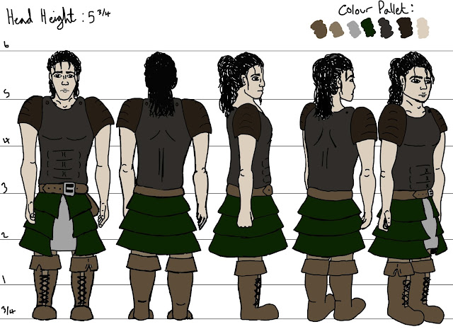
I have re-visited this page where i showed the different angles that Andromeda looks like in the views, this is because i wanted to see how she looked fully finished and in different views, like front, back and side. These turned out well as she really looks more animated as soon as you add colour and draw up digital versions. This also makes the page easier to understand which details are which and what she looks like overall. This also let me see the colour pallet i picked in different ways and let me decide if i defiantly wanted it for her when seeing it in different ways.

I have also made the head height more clear behind her and more distinct, as well as showing the final colour pallet in the top corner so you can see when they were used and tell where as well. I think after doing this page i will go onto doing more poses in digital as i feel it lets you see the character in a different light and it all become clearer. I will do this with more dynamic poses as it lets you see better views and really shows how the character moves and fights.

Here i am also showing the black and white version of the character. I simple went onto photoshop and changed some of the adjustments so they turned it black and white with the background staying the correct white and the shading standing out. I am still going onto do the other poses but this shows different forms of detail that are not obvious on all the coloured drawings of my character.

Visual Language- Study Task 2 - Captain Character- added stuff after assessment

Emotions and Poses

After having the peer assessment i came away with a list of things i wanted to complete so i could make my character as thought out and completed as possible. Here i have completed a few, which were to have more poses and an emotions page so i could show my character in different dynamic positions as well as showing what her face looks like for different expressions.
This is the first page i have completed showing what Andromeda looks like readying to fight as well as casually carrying a sword after training. This shows her in a more casual way in normal clothing compared to armour, this made me think to have another page of front, back and sides so i can show her casual dress. I have also shown what she looks like in battle so you can see her weapons as well as poses of defence so use when doing an animation to show how she fights and how her body moves.


Here i have done another page of poses as i wanted them to be more dynamic which i feel these are. I have left them in a basic form because i feel this was all that was needed as i only needed the poses not the colours or features as i have already shown these on other character sheets. I think after doing this page i have shown a lot more of what my character looks like when fighting and when using the weaponry. This means if i were to animate this character, i would be able to show her doing a lot more than if i were not to have done any extra poses after the peer assessment.


After doing this page of emotions, it became very clear i found it harder to show emotion on such a realistic human face. Only a few of the faces look like my character so i really need to practice working on drawing people with emotions so i can learn how to draw the lines on peoples faces, contortions and how their whole face moves accordingly. I really liked the war face used when trying to intimidate the enemies as it looks like my character but also looks like a good expression.

I was aware i wasn't the best at showing emotions or expressions as i hadn't really tried it all that much, especially when trying to keep the face the same on all of them so this has really shown me a section that i need to improve upon when i come to design other characters, i really need to be able to do this stage as character show many expressions when in animations so if i were to animate, i would need to be able to show reactions from my characters. This overall will defiantly be something i will improve upon and learn from.

Visual Language- Study Task 2 - Captain Character- Peer Assessment

Peer Assessed on the Task so Far

Concept/Idea and Content of the work:
When seeing all of my work people liked the unique style, poses and the outfit. I found this good feedback as i was not sure if others would like the character and i dont know what my style looks like so it was good to know others can see it. I will use all of this feedback in my next project to try to do more of what they like, like poses, designs and originality, so they can like the next design too.
Visual quality and Presentation of the work:
The bottom feedback said that the visual quality was great but that i needed to include more colour. I completely agree with this and it was going to be the next thing i was to do as you cant fully see a character until they are fully rendered and finished in their final colours and designs. As well as that comment one said the clothes were interesting and the other liked the armour so i am confident in my choice of character outfits.
Comments or Advise:
I found this section to be the most useful because the reason to peer assess, is so show people what you have done so they can tell you how to improve it and what work to do to make it better. To make it easier for me to see what improvements people wanted me to do, I circled the advise that shows the next steps i will do to make my character look better and have more variations. Colour was mentioned in the section above so this is something i will defiantly do after this. Another was more poses. I said in a previous post that i wanted to do more so this was further advise telling me they would like to see my character in different ways.

Expressions is another section i really need to do so i can show what my characters face looks like at different stages of feelings. As well as colour some said show her in digital. I really want to do this as it will show me another version of her so it will be good to see, especially if this is in colour too. I will do this on Photoshop so i can change the colour slightly for shading and to make her look more 3D.

Overall this was very helpful for me as now i can use this as a form of tick list so i know what people want me to do and what needs doing for my character to be as good as she can be. I will now go on to do these and progress on with the character i have designed.

Visual Language- Study Task 2 - Captain Character- 2/3rd's, T-Pose and Pose References

2/3rd's, T-Pose and Pose References

This is one of the important sheets that is needed when designing a character. This lets you see different angles of the same character so it is easier when animating them and converting them to being 3 dimensional. I am happy with how this page turned out as it really shows what my character looks like and how tall they need to be. As it shows, this is the front, back side and 3/4 views. These are done in pen so i could make all of the details stand out and make the character easier to see and show the detailing on the clothing. I have not done these in colour as i have not done enough testing on my characters colours and which would look best on her so this will be a step i need to do in the future.

From doing this stage i have been able to show the people seeing my character, what dimensions she has and how she would look if she were to be made 3d. This was such a crucial stage for this and i will defiantly do this for every character i design in the future as you cant animate a good character without first looking at the width and height of what your making.
This T-Pose is so you can see the front and back views of the character and what they look like in a basic pose. I also used this when designing to make sure the arm length is the correct length for the body size and so they dont end up too short because when i first sketched it out, it ended up looking wrong. I also used this to help me get used to drawing my character because i find it difficult to draw things the same over and over again, so this whole project is a good practice for this problem.
This page shows different key poses for my character. As she is a warrior she needed her weapons in some and in the top right, she is just sitting down to show how her body looks in different positions. I need to do more of these poses as she needs to have more battle poses and to show more of her for references. This again can help me get used to drawing her over and over again to get used to the size she is, her features and outfits. These include her in a more casual outfit thats under her armour which i still need to draw so people seeing it can see what she is like out of her outfit. This is also needed to show she is female as some cant really tell with her battle dress on so this lets people see.

After the work so far, i still need to do emotions, her casual outfit and colour so i can really show what she looks like at all times no matter what she's doing. I will also do another page of poses so i can show more on her movements. The reason for these pages are so if i were to animate her, i would have these to reference for how the body moves and looks like in different perspectives.

Visual Language- Study Task 2 - Captain Character- Pose References

Pose References

These are all images i used for stance poses for my warrior character, these were used so i could get a good look at what it looks like to stand before a battle in armour as well as holding weapons. I also used these to show her sitting down and when in training holding the sword over her shoulders.

I didn't need these to copy designs, i merely needed them for poses and for how the body looks when in these positions as having good referencing when drawing is crucial to help you get a more accurate design as well as helping you to understand bodies and how the human body looks at different angles.


Visual Language- Study Task 2 - Captain Character- Initial character designs

Initial Character Designs


These deigns were done along the way of me thinking up the character. I was looking more for armour and clothing for these as that is what draws peoples eyes the most, but i also wanted to make a face and hair style that i really liked and wanted the most. These were all done so i could design a character that had appeal and a good aesthetic that people would like and find interesting.

I was happy with these as i used a mix of the different outfits for my final design so these really proved to be of use as i used bits of all of them to improve my final character design. I did like these designs as i did use them all at some point as reference which made them all needed in creating my final woman.

Visual Language- Study Task 2 - Captain Character- Face shapes and Feature Placement

Face shapes and Feature placements

Here i have been trying to draw the same character but with different face shapes to try to find out which looks best on the character i have thought up. The results are again very similar but as i have been creating the same face they do look very similar. I like the first one the most as it is a face shape that looks curved and smooth.
These are for feature placements of the fave i have been designing above. There were to show how different little movements and size differences can really change how a face looks and a lot more creates new characters that could be used.

Visual Language- Set/scene/Sequence-Studio Brief 1- Storyboard

Storyboard

For the storyboard i already had a plan in my head of what i was going to do. This is why i have done a quick post it note storyboard. This was 8 images of the sequence i will be converting into a full detailed storyboard.

I don't normally do storyboards in such detail but as this was as far as we were going with these ideas, i wanted to show exactly what was happening. I feel this worked well as i used ink for the background that is space. This is a deep black so the story i am telling stands out, as the character is the main focus. 

I also like how the banana and packet turned out. I wanted them to stand out the most as they were the theme that this brief was on which was bananas. This is why i like that they are the only colour on an otherwise black and white theme.

After this brief i realised how hard it was to think of different images for the same brief, even though it was only 24, that was a lot when i couldn't think of what else i could associate with the bananas. I had to think a lot about the shapes and colours in this brief as i couldn't stray too much from the shapes and colours or people wouldn't be able to tell what it was supposed to be. Going off this, i think i did well in creating designs that could easily be recognized.
Here are the final storyboards.


Visual Language- Set/scene/Sequence-Studio Brief 1-12 extended designs

Extended Designs

This was the original design that i am going off for my extended designs and storyboard. I  wanted to look at different mediums that work well with this design, but also different angles and perceptions to show how the story looks when in different styles.

I did 12 designs that will be used within the storyboard of different images from the storyboard sequence all in different mediums and trying to make them all as different as i can.
These are all the same image that i have done to show experimentation of the mediums i found worked best in the first 24 images of the bananas. Here i have used Chalk, Grey Felt Pens, Pen and Ink, Tonal Pencil and Watercolour. I really liked the look of when the picture is black and white and the banana is the only colour as it really makes the theme stand out as well as making it really look like the main focal point of the image which it needs to be as that is the theme that i need to show. I love the softness i managed to get form the chalk piece as it made the whole character seem soft and not threatening. I didn't like the tonal pencil as i felt it was too flat and didn't make any particular points of the image stand out. I also found this for the pen above, it really doesn't stand out as much as watercolour, chalk or pen and ink. I will apply these findings to my storyboard making sure i make the bananas stand out and have the space background fully black.

 This image adds a dynamic pose into my designs as the astronaut is reaching right to the screen and therefor the audience. I really liked this design so i have done 3 different mediums for the same image, Black and white watercolour, Ball point pen and coloured watercolours. I really gravitated towards the last design as you can really see a unique look at the suit and banana bag. Even though i still think i will use black and white as the primary pallet, i like the bag being green so i will use this when designing the storyboard so that the bag will defiantly stand out and really show the message and theme i am using.
 This is a close up of the astronauts head so you can see what he is seeing in his visor. I did this in ink and though i like the surface effects where you can create layers on land with no lines, i dont like the rest of it as it all blends into one too much. There isn't enough definition between sections. In the future i would draw it up in pen first and then go over it with ink as it would then have sections that would be shown. I would not use this for the story board as the windows are small so trying to do these details with ink wouldn't go well as ink runs and it better for large sections.
 This is the frozen banana bag that the astronaut will be reaching for that i have done in felt pens. I have done it in the same colours i have for this whole story concept, which is greys and the yellow for the banana. This shot will be used in my storyboard to show what the astronaut is wanting when floating in space but cannot have. I did not like the felt pens compared to the effect i can get with pen and ink so i will be changing the look of this for the final storyboard designs.
These two designs show another angle of the astronauts suit and the fact that he is just floating around near the moon before he comes across the bananas. I chose to show coloured pencils and chalk to show the textures and tones that this character has. I prefer the bottom one as it stands out and looks 3D so i feel i will add this effect in the final storyboard design. I found that to create and animation that is visually interesting, you have to show angles and shots so that it creates something that keeps the viewers interested and the stories flowing, this is normally shown fully in the anamatic as it shows where each shot is shown and where each scene is transferring to.
This is a shot from the his visor helmet. This shows just where he is and that he is on or very close to the moon. Again i think if the pens were pro markers so you couldn't see the lines, it would look a whole lot better but as they aren't, it just makes the piece look to childish. I do want to keep this though as it looks dramatic and shows that you cant see the face of the character in the mask.

I will now go on to do a storyboard using the mediums i have found the best overall and using these different shots to tell a story of how an astronaut comes across frozen banana in space and tries to eat them, but cant as he has his helmet on. This will help me show how i will use camera angles and how i will keep the audience entertained so they can keep up with the concept and story.

Visual Language- Study Task 2 - Captain Character- Character Details and Body shapes

Captain Character

The brief of Captain Character was to design and create a character but i had a change of heart with my last one so i fully started again and this was the new story and person i thought of doing. I have always loved period characters so i was eager to start designing and creating this character as she is a warrior from the 14th century called Andromeda Perseus. For this i did the same page where i looked at the characters age, name, job, backstory and personality but also what type of character i have created. These all go towards people understanding the character and help me to remember key things about her and bring them across to her personality and looks.
These two pages i have done are for the testing of body shapes, these were all the possible shapes of my character from taking basic shapes and adding them to a human shapes form. These were very useful as i had not decided the shapes yet and needed to experiment with what i could do. I ended up going with the second to last design as i wanted my character to be buff as she was a warrior and i didn't was to sexualise her at all but i also wanted her torso to be slightly longer as she is short but with lots of muscle.

These were testing where the body and torso's should end and length's of the body sections so i could see proportions until i found one i preferred. They were only small changes but i could see a clear difference as some legs were too long, for some the body was too small and for some the body was too wide. This is why i went for the 3rd design as she was just big enough to look like a warrior amazon woman which is what i wanted her to be.

Visual Language- Study Task 2 - Captain Character- Original Character

Original Character

After being given this brief, I quickly designed a character i thought i liked. I really liked that the backstory made him a mean character as i had never done a character like that before so it let me see what other characteristics i could explore. After thinking about doing a large project like this with him being the only character however, made me think of doing another i would be more interested in for a longer period and would be more interested in.

The reason i think i felt like i wanted to go another way with this brief would be that i thought i could do better, i was fine with the story and body but as soon as i added the face to the design, i really didn't like how he had turned out.

I think on this next character i will plan a lot more towards getting to this stage so i will do more designs on body shapes, head shapes and facial features.

Visual Language- Study Task 2 - Captain Character- Character Design

Character Design

There are many things you need to think about if you want to design a good successful character. These include; details on the character, backstory, shapes they're going to be, expressions they could have and overall personality and traits you would also like to come across in the look of the design.

The first thing you need to think about when designing is who you want your character to be. A presentation was shown to us by our tutor that really opened my eyes to how much thought goes into each design. Walt disney would say the same as he referred to Mickey Mouse as "Part of the family" when he had designed him because you plan so much into their traits, lives and backstory's that they become almost real to the creators.

Getting their look to match their personality is key, the wrong look could make your beloved character end up being unpopular to the audience, so tying everything about them into something that people can see and understand makes for a more loved character. If you want them cute, make them look cute. If you want them to be the villain, make them look bad or evil make them very obviously a nasty person. These can be seen bellow as old characters that really fit into the stereotype groups, but worked so well and were loved by all. 
After this point you fully have the image in your head about what you want them to have as traits and personality, so now onto looks. This tends to be done with basic shapes so you can just see which one you like and then build your character on top of them to see what they look like. This is an easy step to draw out and really helps you look at the possibilities.
Same with head shape, where you can imagine which head shapes will look the best on the chosen body shapes, These can be quick and sketchy becuase then you need to design the face on top. This can be done realistically but then can be taken to the extremes because all create a new character, one you may like better or one you really like for future use that you had not thought about. 
Head hight is an important step when getting across your characters size for the animators so they can consistantly keep the characters size and ratio the same. This is one of the sheets that animators will look at the most as it shows just how big the character is but the one used the most is the one bellow.
Now this lets animators get the full dimensions for the character, as well as what it looks like through fully turning so they have all the angles they need. This also helps you to see your character in 3D as 2D only shows you so much. When colour is also used, it makes the character look more complete and ready to be animated straight away.
This final section that needs to be done when creating characters is emotions. These need to be used by everyone as references to show what your character looks like when their face is being strained, relaxed, squished, shocked, pushed and pulled if needed. Its just so you can also get used to drawing your character to look the same, but also be able to show emotions that people will clearly understand.
As you can see these are some of the many steps in character design that i found is used in the industry and it really makes you see all the work that goes in to every character that makes its way to the screen. I will be doing all of these in this project as we will be designing characters of our own.