Since I am doing a stop-motion for this project, I felt getting more information about the field, people currently in the industry and how they started out would be of great use to me when it came to filming and production. This is why I went to a convention talk with "Puppet Masters" from different experienced backgrounds.
These names included; Chris Tichborne, Barry Purves, Brian Cosgrove and Merlin Crossingham. Each have worked in the industry for many years therefore have built up quite an understanding of how it works and have an amazing portfolio to talk about.
First up was Chris Tichborne who had worked on all of the Tim Burton stop-motion animations and showed some of the scenes he actually worked on. He started out talking about how he found his way into the field and how he started out doing little lego animations in his room. This is really something I need to do more of as it all adds to a portfolio at the end and builds up more of a substantial body of work under my belt.
Next was Barry Purves who had been in the industry for many decades and worked on more niche productions of his own as he focuses on acting and how it can be shown within the characters and how the animator is only great if he can show emotion not only on the face but within the body. He also made me think more of the eyes. Eyes are the window to the soul as they say so the same much be for characters as the audience must feel for the character. He gave a tip on using Vaseline on the eyes so they add an extra sparkle when filming. When filming he also said pay attention when there is dialogue so he zooms into their mouths so it feels more like a live action as the voices must be heard so the camera cant be too far away.
Between breaks we went to the museum as they were showcasing some of the Aardman characters and their concept art. This let me see them up close and understand the process they take more. It also showed the concept art and how it was turned into the end result which all let me understand the industry more and see the possibilities, as i've always been interested in concept design as a job.
This was Merlin who still works at Aardman and does the Shaun the Sheep movies. He was one of the most inspirational to me as he posed the most hints and tips to me as well as insights into the Aardman studio and how he got into the job. As you can see from the image behind, he started out doing basic characters when he graduated and grew from there so it gives hope for what is possible for the future.
Suspension of disbelief- you believe and suspend the audience in the world you have created. This is a point proven by Aadman and Tim Burton as you don't question it, you believe and everything fits together.
Das Rad
An Object at Rest
Both films were about the passing of time, told in the eyes of rocks. These both dealt with the struggle of showing time rushing by. One of how a rock could be used and where they get used and shipped to, the other dooming mankind on their technological journey.
Story telling can be harder for stop motion as you only really have one set most of the time, whereas with digital animation, the only issue is your skill of drawing backgrounds.
The Art of OOO- Book i should look into
Logline
Show focal character, plot line, villain
Try not to use names, use names to tell personality
Maybe explain the ultimate goal
The antagonist should show aim or personality
Don't give away the ending too much
Don't tell the story, sell the story
Tagline
Sum up the movie as a whole
Slogan
Synopsis
Brief summery of it all
Final Script
Thinking of character
Set
Personalities
Doesn't give anything away
Sound so sound designers can go forward with it
make sure storyboard artists can understand what is happening
These are all very important in how the overall animation could come out, think about it carefully and plan each section out.
The intrim crit is done to see what progress has been done in the last few weeks as well as letting me be opened up to peer feedback on how to improve my idea and go further with it. Core Idea When I have been planning my work and ideas. The anamatic was done as well as the storyboards telling the story of the male zombie, losing his love when he comes out of the grave but after searching around, finds her. As I am a lot more confident with the female character compared to the male, I am going to switch the roles.This means the story can in essence, stay the same but with switched characters. This means the woman will come out of the grave, find her husbands arm on the grave instead of the flower. She will then go to find him and when she done, re-attaches his arm and he gives her the flower. I will storyboard this to i can see what the new story is going to be so I can follow it when it comes to making it. The Set
As I have been struggling with how to actually assemble the set, even though i know what will go inside it. I asked everyone if they had any ideas. Most thought it would be overall easier and look more effective if the background were to be a green screen. I dont really know how to do this so it looks effective so I need to research further into what it could look and if i could make a better background in Photoshop than painted which I think I would be more confident with.
List of what i need to do now:
Character sheets
Individual objects to draw for the set
Draw out the finalised set
Turn around
Colour pallet tests for the characters
Build characters + set
Stop Motion Research
One peer told me about how the Corpse Bride characters were made which i will have to look at as i will be using fabric for the female and male characters so I would like to see if there are any tips I could take from the behind the scenes.
This week i have been thinking about the storyboarding and buying all of the fabrics and materials needed for the characters. As i have done more for the female character, i decided to make a start on the concept designs for the male character. As I find male characters harder to do, it has taken me a while to get going with him. This meant i didn't feel as far along as i am supposed to be.
As i wanted the two to match and clearly look married, their outfits needed to look from the same era, which is the victorian era. The look Im thinking about would be waistcoats, trousers, shirt and maybe either a bow tie or braces. I like the look of the face in the second design out of all my concepts bellow. He looks the least threatening while still being a zombie. The lanky skinny look is also more ideal for building as it means less of a body needing to be bulked up, and less material would be used.
The characters bellow range from different features and styles that i was testing to try and get a good look overall, if i did want him to be threatening, i really like the middle bald character and how he looks. But as i am wanting more of a kind face for the zombie, this would not fit the brief.
This was a make-shift set so i could look at what the camera placement within my set could look like. As this was quite a large set, i realised how much i needed to scale down the characters, bellow she is about 20 cm high. This would be great if i could build a larger set, but because of time and me wanting it to look as good as possible, i don't think this will be possible. I think for it to be more portable and look better overall, i might make the set out of thin light wood. I just need to build the set and then i can get going and start making all of my assets.
So i know exactly what i am building, i will draw out all of the objects and what they need to look like. So this will be a step for me to complete next as well as finalised characters and the character sheets.
Here i have already started on making the female characters framework. As i am scaling her down these were good starting points so i can see which material works best. I started out drawing the female again, then doing a wire frame next to it with the same measurements. After i bulked her up with where i needed to have the bigger bones to go and the fabric of the skirt.
The wire frames were done in two different metals, One thin and more pliable, and one thinker but much thicker. The thicker one would be a much more stable character to build and create but i don't know if it would be too hard to create motion without ruining the character when trying to bend her into different positions. I am thinking of using the thiner metal but instead of twisting the metal into two, i may double it again to give more stability, but till be pliable and flexible.
These are the storyboards i have done so i can map out my story and work out exactly what is going to happen, in what order and when. I found this was actually really good to do for me as i hadn't quite worked out how the end was going to play out so this forced me to think of why things were happening and to what end. I don't normally do storyboards in photoshop, but i really like how the Digital look can add different more subtle colour to the scenes. I can also duplicate the backgrounds so they can look the same and only small motions happen, this means i can create a more accurate storyboard, as it will show motion, not just arrows to show were motion would be.
Im still not 100% happy with my story so when we have the intrim crit next week, i hope to get insight into what others think of it so far and what i can do to improve the idea and see if the story makes sense to other people.
This is the anamatic with a bit of sound testing so the audience can see what is happening as well as letting me find out which sounds i would like in the final animation.
When starting out a new project, I always want to get a visual in my head, this is why I do a few different mood boards along the way for different aspects of the projects Im doing. They also let me see colour pallets, references and what is out there already.
This was a mood board of key elements i want in my project. For it to be set in a graveyard, For the main character to be a zombie and for it to be a stop motion. This let me see that the colour pallets are mostly browns, greens and blues.
This second one was when I was thinking about the set itself. As it was in a graveyard, The question was, how i was going to create a background that looked to be going into the distance, but still having a small set. This really makes you think about placement and how to trick the audience into thinking the graveyard the characters are in, is a whole lot bigger than it is. This also let me see what mediums could be used to create a good scene and a good looking set.
Looking at what is out there, zombies have been very popular in tv shows and in the industry at the moment so there are many different looks, styles, shapes and colours that can be seen. This really makes it difficult to choose one that has its own overall look and personality. I dont want an aggressive character as it is more of a romantic animation. This means many of these designs can tell me what to stay away from and what i should be going for, for him to be more innocent and not a threat.
This was when I came up with the idea of creating a love story, the skeleton in my animation was originally going to be a prop. Since the start it has progressed into a zombie loving a skeleton. This mood board was when i originally was going to have the two being zombies, but i thought since my chosen brief is opposites attract, them being different stages of undead, it seemed more poetic and endearing. It still helped me in the progression of my story and let me see what the female could still end up looking like.
As I am more comfortable doing female characters, many ideas were coming together for what the overall look of the character should look like. Wether she should be cute and all bone, or bone showing but like a sugar skull woman, or if i should do more of a comic look. This can all be seen in my other post about where i was taking my designs and what i have been practicing for the aesthetic.
When testing the designs, I drew one in Victorian dress. This really made me want to use this as the era in which my animation is held. As I am also doing a stop motion, I will be building her outfit, so I have to make sure I research the era and what the dresses should look like. I have always wanted to do a character from the Victorian times, so this was a great opportunity to do so, this is why I am very exited about this project and what i am doing.
A character should play an action until something makes them play a different action
All action begins with movement
Audiences empathize with emotion
A scene is a negotiation
Narrative couldn't be more important in creating a captivating story!
From this i realise how important it is to plan out the characters with emotions when animating as it is key in creating something the audience can believe. I have always used references when creating animation so i can really see the movements and what the character needs to be doing, but i have never thought about the emotion of the person and how it could effect how the audience perceives my character, so i really need to think of this in the future.
I have always wanted to work with actors or dancers for animating so i will try to do this in the future so i can see how they flow and show emotions, which need to come across in the final characters.
I need to watch old movies and skits like Charlie Chaplin and Laurel and Hardy as i grew up watching them and i really need to see how they managed to get their emotions and actions across to the public with no words present.
The final idea for my animation brief, Telling Tales, is about a couple who have both passed away. One has come back as a zombie, yet the other is a skeleton. He will come out of his grave to see her missing, so he gets worried but soon finds her and they come together.
With this idea, i needed to make sure i picked the story i wanted and stick to it, as this was a problem i had in the past which stopped me from starting and getting going. This year i have chosen within the first week and now i am well underway in my pre-production and planning out the module and the work load.
Script I started doing a rough script with who was going to be in the scene, where it is, what is happening and noises that are going on. I did this so i could still have a chance to change and go further with the ideas i have, but also make sure i have planned out enough to make sure i know what is happening and with which character. I will now write it up on word so i can use it as a guide for when i am setting up my animation in the stop motion set and when i start to move the characters around.
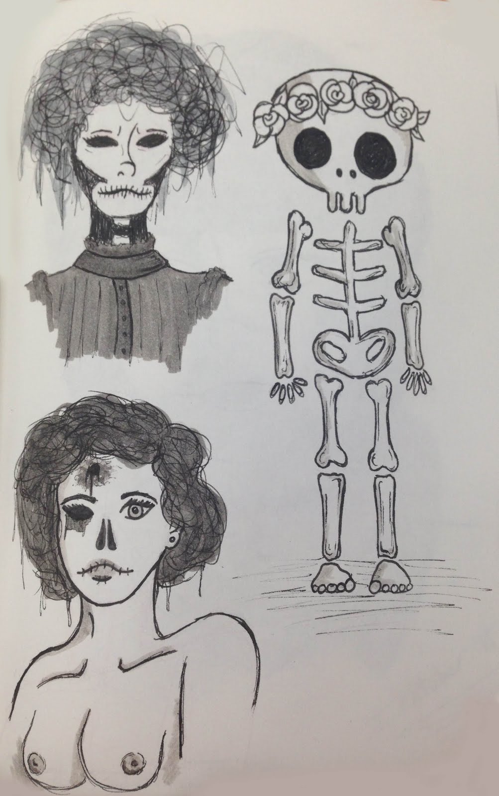
Female Skeleton Character (Belle)
These are the concept ideas for my female skeleton. I couldn't decide wether or not to do a more animated cute character, or a more humanoid character. At first i was testing out different ways to do a skull so that it can look female so the audience can understand my story from the start. This is why i added flowers and bows to many of the designs.
The two i struggled choosing between, would be the bottom left design and the cute skeleton above. The reason i struggled, was because they are very different in style and look overall, so choosing between the two, would decide on the overall look of my stop motion as a whole.
As you can see i preferred the bottom left skeleton deign that still looks quite humanoid, but has bones, rotting flesh and the bullet wound showing. As i became more comfortable with digital, i have done this character on Photoshop, i have tried a few different eye designs and a body shape/ how i am going to make it. This is because stop motion means i need to make the character, taking that into consideration, means i need to design accordingly and thinking of how this character is going to be small.
I started the female design first as i am generally more comfortable designing with females, and developing their looks. This is when i thought more on my actual story and how the couple could be from the same era, thus backing up my story, to be about their Opposites attract theme as she is a skeleton and him a zombie but they're still in love.
Here is when i thought more about what the outfit should look like and how i am going to make it. The first design is by a fashion student i am collaborating with who was thinking about what elements could be made and which would look good on a small character. The other three are some i have come up with for what i think the character should be wearing and how she looks like she is from the victorian era.
On this project, i will be working with two fashion students, who go to a different university. I am asking for help because in the first year, the character i designed, i didn't feel was as good as i was able to achieve. I will be asking them about fabrics, pattern pieces, the overall look and how to change elements for things smaller (buttons of knotted fabric as buttons cant come that small) This has really made me exited about the project as i know what i am doing clearly, and i can get help into making the characters i am designing, look as good as possible for the stop motion.
This is a design sheet, done by one of the fashion students that i have helped design. We were talking about how the character should look, her body shape, how she will be built and which elements of the era i wanted to show more of in the overall look. As i have never made pattern pieces, i found her help to be very useful and really made me think of what i was doing and how i need to think about how i will make it.
Im overall very happy with how she is looking but i am not sure about the bottom half of the dress but the top half is exactly what i wanted. I will carry on working with them both so that i can get an outfit i am happy with and making the character exactly how i imagine her to look.
Male Zombie Character (Vincent)
These are simple head shapes and facial feature placements for the male focal character. These are just so i can see which ones work better for the character i am thinking of. He will be a zombie so i have drawn more longer faces, as i feel that the shape is more fitting. As he will be dead, he will be lanky so longer features fits with that thought.
Set Design
These are the set designs i have done so far. I was looking at where the camera could be placed and what shots i needed to achieve. These are all helping me to get a more clear image in my head about what i want the animation to look like overall and what the environment should be like. I found that when designing, the scenes can look too flat if too much is placed against the back wall of the set. This is why i started playing round with placements of everything and what backgrounds could be drawn on the backgrounds. I am liking the end result more than the rest, as the other designs were when i was testing space and placement, so the bottom design is what i have been working towards creating. The idea of a path, also creates a way for the eye of the viewer to travel through the scene, not be stopped at the flat base. I have also been looking at where the camera needs to go and which walls need to be built. If i make the scene larger, i can build three walls. Therefore creating more of a large feel within as there will be more background, but i can also have more camera shots and angles.
This seminar was to make us think about how to do a short story animation with a script and thinking into animations narrative's.
Explicit Narrative- Plain to see (Normally what younger viewers take from the story)
Implicit Narrative- Hidden/ mature meaning
Cordell Barker's-Runaway
This fully animation is 9minutes long, yet clearly shows its Implicit message to be about classes and how the lower class and poor folk, sell whatever they have for money. Yet the rich con the weak and poor for their own gain. This really made me think of how much can be accomplished with no words and a short story's narrative.
What a story needs; A well thought out world, a main character or two that are clear and understood, and a problem that much occur for it to be interesting.
RoughCut BirdBox Studio's are a studio i am looking into more for narrative, as they dont normally use words yet their world and idea's are plain to understand. Their backgrounds, which i also like, are very plain and simple, yet aren't needed for it to have characters that stand out, and draw you into their environment.
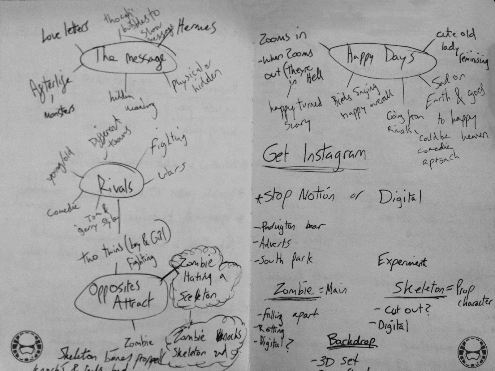
One the first day of getting the brief, I did some spider diagrams of ideas for the titles and which stood out the most to me for potential. These ended up being, The Message, Rivals, Opposites Attract and Happy Days. I really want to work with stop motion this year as i didn't manage to do it last year so i'm thinking of ideas that i would be able to make, build and film that wouldn't be too complicated.
I was originally thinking of working with someone for this project but when talking it over with people who i were also going to do stop motion, I didn't feel confident enough to work with them with the ideas they were going for, but I will defiantly have to work with them in the future to get used to being with others as in the industry your never working alone.
The idea i've had has changed and progressed through the week of when it was set. Ive been storyboarding along the way to show where my ideas have been going and what they used to be compared to the final idea i have thought of. I did these as thumbnails in a note book so i could jot down ideas quickly that i didn't need to take too much care with.
These were in a graveyard where a zombie was coming and discovering a skeleton who's head had fallen off which he was going to correct (left) or a zombie breaking out of his grave (right)
First Idea
The briefs, my ideas work into would be The message, Opposites Attract and Happy Days. The environment and scene will be in a gravesite so, Im thinking of a zombie coming out of his grave, struggling and pushing his way out, before finding the grave next to his being empty like something else had come out of a grave too. He will look worried before walking around the site and finding the female zombie sat on a headstone looking at the moon. When he walks up and she turns, the audience will realise she has one of his arms as her own, connecting them together.
Im hoping to be able to build all of these as stop motion characters and set, but i would like to experiment with paper cut out and digital so as i progress i am needing to be thinking of how i would like the overall piece to look. My tutor suggested looking at Paddington Bear, I had not realised until searching it that the set used to be done in pen, Paddington was an actual bear and the people around him here paper cut out and some digital so it was really interesting to see how all the different elements look in one animated story.
Blog:
-One per week
-250 words min
-What have you done?
-How has it helped?
-1000 Evaluation
-Potential and Limited techniques of the medium
Telling Tales
For this project we need one focal character. If you decide to work in pairs it needs to be two focal characters. The animation will be 30 seconds, unless in two pairs, then it would be 1 minute long. we will be working on the production of the animation in this brief;
Pre Production--> Production--> Post Production
It does not need dialogue but sound must be present. I need to think about the environment as this can be as important as making a good character as it is the world that you create for the characters that helps the come to life.
Titles to work with:
Happy Days
Predator Pray
Leap of Faith
Opposites Attract
Road to Nowhere
The Message
Last Chance
Adrift
Rivals
This project much be finished at H264 not Quicktime as it is not supported anymore.
I would like to do much more research for his project about the medium, we have 5 Substantial blog posts to do on the focus topic. This should help me to think more about the process of animations as well as the end product. There needs to be 200 words per post and could be about; Sustainability, Technique, Aesthetics, Process, etc and need to research into facts on the medium of my animation.
This has been one of the hardest modules i have done. This is because i found i didn't enjoy doing it therefore, it didn't inspire me to do it and push it to be amazing. Even if i am not 100% happy with my final piece, i am still happy with certain elements. The backgrounds were a lot better than in my first project as i feel i have grown and come to learn more about environments from Visual Language. This meant they could be cleaner and more polished and professional than i have made them to look in the past.
I also really liked how the film clips turned out after i altered them and cut them out. The oil paint effect really helped them to fit into the scene, but also look like mixed media and stand out. This was a real experiment for this animation, which i really liked doing. It produced an effect i had not tried yet and really wanted to see what would happen. This meant i made many mistakes along the way, but it let me learn how to fix them and make them better by the end or in the future.
The way i started the project started out good, but then i got stressed when the idea got lost along the way, this made me slow down and not work on this project as much as i wanted to. This was along with working on so many projects as there were 3 running with deadlines for the same time, this made it hard to work on them all and have them all get done to a good standard as i haven't fully leant how to project manage and work on them all equally.
Overall i am happy with the module but i wish i had more passion as i was working through it, But this gave me a lot to improve on in the future and learn to better myself and how i work, as this course is very difficult so it is important to learn to cope with the work load and how being handled.
In the future i will make sure to set out diaries of my work schedule so i had a time frame to work with for the week or days, just so i can keep on top of everything i am trying to accomplish. I was also told for my last animation, that is was too linear. I have tired to show improvements on this by showing different camera angles, as well as having the camera panning and moving around. This was to try and keep the interests of the viewers as well, this is so my animation can keep people interested enough to receive the help they need. I did remember all of the comments on the first animation i produced, on what to improve. I have tried to fix all of these issues in this modules which i hopefully have achieved as i worked to develop my skills further and show i have learnt from this year, which i have. At the beginning i couldn't use any software or understand how to animate at all other than stop motion so it was all new to me. This meant i had a lot to develop and understand, this i feel i have achieved.
This is my final animation with sound and all of the elements added. As sound is such an important aspect of a good campaign advert, i think the song i chose works really well with what is happening, but also sounding hauntingly beautiful and pure which helps to show how the character feels isolated and alone within the world with this illness. This is why i am proud of the animation as it could help someone who was suffering, the only thing i wish worked better, is the creature as it stands out so much and i know i could do it to a higher standard. This is why i am going to spend so much more time in the future, not just to start the animation, but also with the concept design and development. This is becuase if i had a clearer image of the creature in my head, i know i would have been able to develop it further into something better, with a more lasting impression. This would also let me include more animation movement as i would have been able to have the creature moving about more.
As a first attempt at an animal, i feel it does work even if it is rough. You can clearly see what it is supposed to be and what i am aiming for it to be doing. This just helps me get the message across easier, as well as the campaign being more clear for viewers to understand and glance at and see what was happening to the character.
One of the main problems i had within this animating process, was time management. As i am a first year, this is all about the mistakes i make with the projects, not just in content, but in how i approach them and work on them. I was relatively good at time management until the end of the year as all of the modules stacked up and the deadlines grew closer. This meant i was stressed for a large amount of this module so couldn't enjoy working on the animaiton. I can see this in the final piece, as there are many things i would change in the overall look and how i worked on it.
I kept flipping from many different ideas for this task which meant, for the majority i didn't work as much as i could. This would be something i am changing straight away, as i have found i need to keep on top of everything which is why i am setting myself daily tasks and instructions on things to complete which has helped me greatly.
One of the other things i really wanted to change, would be the creature. If i were to redo this module, i either would have done it more as an entity so it seemed more threatening overall, or i would have made the dog much more detailed so it fitted with the character more. I am very disappointed in how it turned out, but i am a very harsh critique of myself so this makes me always want to change different elements of my work to make them better.
I am glad i got to experiment with elements i had not tried before. One would be the cut out film which i do like the overall look of as it looks rough and jittery which is the look i really wanted to achieve. This is alongside the backgrounds i designed. I liked making them look cleaner than i normally would so this is a style i will keep in the future and bring across to my next projects so i can add this element to them too. It looked like are real mix of media in the final piece but i think i liked that as it looks different and eye catching to the viewers we are trying to attract for Samaritans.
When i was adding all of the scenes up, I was originally doing them all together. I quickly came to realise this would not work as the software couldn't handle all of the different elements i was trying to bring in. This is why i ended up building all of the scenes separately so i could bring them all through at the end and have it all end up in one place complete. Then all i needed to do was add sound and final touches.
This is just a learning experience for the future as i wasted a bit of time working through it all in one area and it kept either crashing or freezing. This would be my way around this in the future, especially when the animation start to get longer and larger.
As i was using film clips for my animation, i needed them to look cut out and rough. You can see this in these final screenshots of my animation with the person included, This meant it looked like another element i had experimented with and was able to add to the outcome. I added an oil paint effect to each one as well as i wanted it to look like the person was painted by hand for each frame. This produced a really nice overall look that swirled and moved around inside the character bringing him to life. This made me happier with how they looked as they weren't straight forward realistic film clips, they were art pieces within the animaiton. You can see a really nice effect on the scene where the character is outside and walking forward as the design on his shirt swirls into his body and around his clothes.
Because of how dark the room was when i was filming the bedroom scene, it doesn't look as fluid and soft, this meant the effect wasn't as good in the final piece. Next time i will work more with setting up good lighting in each area, so each scene can be clean and filmed properly.
One of my biggest difficulties, would be working with the dog creature. This was for many different reasons. One would be the feedback i received about my idea. This really through me off and put me really behind on my animating as i lost faith in my entire idea, this has made me really unhappy during this module as i wasn't confident that the work i was producing was any good or even a good story.
In my next year, i'm defiantly going to have to stick to the idea i decided upon and which is best for me as this would have let me produce something i am more confident showing and saying i'm happy with. This was because i was told the creature shouldn't just be a dog, it should morph between shapes so it isn't just one thing. This made it so i got very unconfident with my concept designs as they were all shown to be dogs. This is however the animal i have stuck with, becuase that is the animal the history shows depression to be associated with.
This made me add the creepy purple hue around the creature though, as this was to show how the creature is infecting the world around it and spreading its pain onto the character. If i were to do the creature again, i wouldn't colour it totally in black though as this meant i couldn't show as much detail, this is why i would do it a dark grey to show the black outlines to be detail, or i would use white highlights within the black dog to show isn't features and depth.
After filming all of the scenes, I wanted to create backgrounds that are different to what i normally create. I normally just sketch the backgrounds and build them up from there. This time, i created the backgrounds with very geometric lines so it looked neater and overall clean. This took a lot longer than normal, as i wanted the scene to look as accurate as possible, as well as keeping all the perspective correct and keeping the character as the focal point, with the dog. These scenes are all different in colours as i couldn't create them all black and white,even if it would have added something for the theme. This was because i did this in my last animation and i wanted to show growth and something different in this animation. This is why i showed a different style, different method of doing a character as well as the dog character i have designed. Here are the 4 scenes i have designed and coloured for the animation. There are two scenes from outside, this is so i can show two different angles.
As I am doing the character for my animation as a film clip, I will be cutting out each layer of the film. This will give a rough look to the outline of the character overall which I believe to look unique and different.
Cutting out the character will also show the idea of the character, being isolated from the background around them, and being different from the world they are placed in. I hope for this to come across in the final piece as it adds another level of story to the animation.
This is what the character looks like cut out of the scene. At the moment, he looks very clean and lifelike, but when I start putting him into the animation, I will be putting different filters on him to get a more oil painted look overall, this makes it so he isn't too different from the designs around him.
This is the street view I will be placing my character within. I aligned him with the kerb so when he stepped off the path, it was in the correct place. After doing this, I started to sketch around the scene and created a simple design. Then deleted the image and built up the scene from what I had sketched, here you can see that bellow.
After doing the animatic, I knew i needed to film 4 different scenes. The kitchen, Outside, Bedroom and Desk scene. These all needed to create an animation story that could be followed, as well as, creating an animation that is sadly only 30 seconds long to create an advert.
After filming the 4 scenes, I found it was very difficult to keep in mind timings. Time moves very quickly within animation as every second counts and includes so much. This meant, I had to be very careful of how long each scene was, and how I showed each scene from camera angles. To get some scenes to look less 'linier' as i have been told in the past my animation has been. I have created different camera angles to keep the viewer interested, and to give different looks to the animation overall. This means the outside scene will be longer than the others, as I am creating different angles for the character to move across the scene, this also lets me show the dog from other angles. This will be a long process to cut out each frame from the filming I am doing. This is because many images are created within even a second, and I think some scenes, will have over 300 frames for the length of time they are needing to be. This means this will take up most of my time but will create a very different effect overall.
I thought of doing pixilation, but i didn't want the eye of the viewer to pay more attention to the character, than to the animal that is depression that is stalking him through each place. This means the character will be smoother and the rough outline will make it look unique enough for it to fit into the scene like a cut out.
This module as a whole has been are real learning curve for me as I was very inexperienced with many of the tasks I was set. This meant approaching each task being very experimental and having to learn along the way. This meant for each task I have gained knowledge I didn't have prior to the start. Yet as I was also new to many things this also meant I didn't do some tasks correctly or well as it was all about trial and error for some of the section. Set, series, Sequence was the first task were were set and was to see how we would deal with generating 24 images and then a story all from one word, which was banana. I did end up finding this rather difficult when i had done about 15 images of the 24 as it was hard to generate more ideas. This is why i liked this task, as it really made me consider what it would be like for a character designer or concept designer as they are given a small brief and have to design so many images from that. I did love that it gave me a real chance to draw again though because up until that point, it had been largely computer based, so this was a good change of scene. It meant i could experiment with colour, mediums and ideas of characters. I really want to carry on doing work like this as it gives me a chance to get more hands on with designs, so i will carry on doing the process work by hand and the production, to move into digital.
One of the points the tasks had, was to try to do sketchbook work outside of the tasks. I did this by sketching on the go and on transport when getting to different places. This was good as it let me get creative in places where i wouldn't normally draw.
Captain Character was a real learning task as i had never done anything like that or developed a character that much into poses or emotions, as i had only ever come up with designs, but not thought about their lives or different angles of seeing them. I tackled all of this in this task so it really let me see how much character designers have to bring their characters to life.
After this task i found i need to work on emotions, i was not able to do this for my character as they all looked slightly different which was a problem i found difficult to fix. This means i need to work on studying the human face more, but also designing a character that i know i will be able to visualise from every angle and perspective. I did like how the character turned out though and the amount of dynamic poses i was able to do for her. This meant the people looking at the character could imagine her in many different positions when fighting or in different stances.
For study task 3, i wasn't able to do the turn around so it was smooth. I really struggle to visualise each pose that was going to be the next on in the sequence. This meant her body moves around a lot when she spins, instead of keeping straight. I tried many times to fix this but i just couldn't get the poses to stay constant when she spun. I will be able to fix this next time if i pick a character that i understand more. As i have said, i found it hard to think about her in all of the positions of the spin and turn, so if i were to do it again, i will pick a character to design that i know will be smooth to turn, without too many components or clothing.
When building her, i found it incredibly enjoyable as i got to be very hands on and know how to build a character up from a simple wire frame to a full plasticine figure. This process took 2 days to complete for the character, so it didn't take too long but in the future i will spend more time getting the frame to the exact shape, as i thought if it was a a different shape, the plasticine will build it up, but i just ended up with a character that had a very thin torso and wide shoulders. So next time i attempt to do this process i will try to envision the character fully before building it straight away. This was a really useful stage as it gives you all the basics to start in stop motion, as i now know how to build a character, so i now need to learn how to think ahead to the final piece so the character looks more like my drawings. Although i did feel i worked well with improvising with the items i had, as i created the textured skirt with the end of the tool.
For the environmental storytelling brief i think i did really well. My drawings held a lot of detail of the scenes i was looking at and studying. I sketched bits and pieces from the scene beforehand so i could get a feel for the overall location and then did thumbnails so i could remember the perspectives i need and which parts of the building i want to use. I tried to use different mediums for each location as i wanted to see which could help me achieve different textures, shading effects and aesthetics. Overall i found i really enjoyed this task and i will make sure that in the future i will try to include drawn buildings in my backgrounds as i included a lot of detail and spent a lot of time making sure each on was to a high standard so this is something i found i could do really well, compared to some other tasks i didn't do as well at. After looking at each scene i found i was able to tell the story of how the character would move and flow through the scene, so i will defiantly think about this more in the future as it really helps people to understand the scene and also helps the overall look to be more interesting if the scene if moving and changing with your character as the audience is not just looking at the same thing, with a character moving flatly through it.
Form, flow and and force was really good as a task as it made me think about how the bodies are moving and flowing as to understand the human form more in the future when i animate. I liked they were also short tasks, because when your out in public, people move really fast so it is to teach you to see the basic flowing lines that the human form creates when in motion which is really important to learn. I then researched more artists that did work like this and found they work on tasks like this so it was a really good element of studying the human form that i had not considered before.
Overall i have found i have learned so much from this module that i will go ahead and use in the future to better my drawings. Each task was aimed at a different part of the animation industry and steps you need to know to draw better. This meant that by the end of each task i had researched into each element of animation that we studied and learned a more about who was in the industry at the moment and who's work i really loved and was inspired by. There are many things i would like to apply in the future from this so overall i believe i have come out of this module and term, being better than when i started.


 Between breaks we went to the museum as they were showcasing some of the Aardman characters and their concept art. This let me see them up close and understand the process they take more. It also showed the concept art and how it was turned into the end result which all let me understand the industry more and see the possibilities, as i've always been interested in concept design as a job.


