Tuesday, 19 January 2016

Visual Language- Set/scene/Sequence-Studio Brief 1-24/24

Exploring Mediums & Characters

This top piece is of a banana character thats skirt/ peel is flying up in a Marilyn Monroe classic fashion. I really like this design as the face is very basic but cute and the pose is to show how the peel looks when it is peeled. The pen works nicely as well as it is dark in areas that contrast the light of the outer peel. I would have used lighter colours if i were to do this again as i feel the shading is lost in areas from the tones being too harsh.

The second one down is done in coloured biro and pen and ink. I really loved how this turned out and want to use this medium mix in the future. The basic banana shape is so i could show the different colours from the skin and the banana itself. In the storyboard or designs done up to it, i will use this medium to try to show different effects.


This top design was done in a really good medium for me. Pen and ink lets me show texture, colour, tones and shading. This all added to the final design and how the piece looks overall. I designed the banana skin to look like an octopus with tentacles as i was looking at peel when it doesn't have banana in it and this is how it sits but with the skin flopped down. So this is how the design came about. 

This next design was one i thought of from the start, it was a character that was using the peel as clothes and it was un-dressing to reveal a human bra. This was a funny take on the banana. I was just trying out the medium but i would have used a darker colour next time as it distracts too much from the overall design. I do like the strange face though as it looks weird yet something i'd want to draw. 
This design is another i have been thinking of since the start. I got the idea from my mind map about banana splits and how it could be a banana doing a split. I had the thought of the hair going up into a curl style afro but it didn't turn out quite correctly and could have been better. I would also use brighter colours so the tights and banana boobs stand out more and attract the audiences eye more so.
This is the final design i draw and is one i will use for my extended developing ideas and storyboards. This is an astronaut who has some frozen banana from a packet. I liked this design the most as i could design a good story around it whereas i could not find a good length of story around any of the others that i liked. I used pen and watercolour to show the reflection in the screen and to show how dark the background of space was behind the guy. I will now design 12 extended drawings around this idea before putting all of my designs into a storyboard to create a story about this character and bananas.

Friday, 15 January 2016

Process&Production- Animation Exercise

Animation Exercise 

This was an animation exercise set to try and make sure Squash and Stretch are fully understood and are applied to every animation where it is needed. For this exercise, i made a ball bounce down, hit a wall and roll away till it comes to a stop. I then needed to add sound to make the ball hitting add more of an effect.

This was a quick task that i have done before my animation so that when it came to starting my animation, it was fresh in my mind to have squash and stretch where needed just so i could make sure my animation could include this principle of animation if it is needed in the sequences.

I am happy with the result as the sound is placed at the right moments of contact and the ball looks like it is hitting the surfaces, the ball was also hand drawn so it does change shape but it adds to the style my animation is in. 

Process&Production- Final evaluation

The Other Side of a Hard Worker 

This is my final animation for the Other Side called The Other Side of a Hard Worker. I found the process of animating this to be a lot harder than i had first thought as it was so much more time consuming than i originally planned it to be. Although it is not perfect and i would change a few of the scenes to be better, i am still very proud of my final result. I am also happy i am handing in a complete animation with lots of sound that adds to what is happening and makes it seem more professional.

I would change a few things from the final outcome as i feel i could make them better. One would be the lever scene as i think i could have created more detail with the character even though he is at an angle, but also the lever moves but i couldn't move it down without it moving on a few of the pulls. As i could not work out how to fix this i dont mind that it moves, as it adds to the style that my whole animation looks like. I would also change the cog scene. Although i am glad that i could achieve the effect of someone turning a cog correctly, but i think i could have made the character more consistent all the way though and make it look more professional. I think this would add a better look to the overall piece and i wouldn't find as much to critique from my own work.

I found lots of different sounds very early on which proved easier than expected as i thought i wouldn't be able to find factory sounds as easily as i did, but i am very happy that they go with the animation as well as they do. This is because when listened to, it sounds like when the character is outside, the sounds are farther away and when the scene has machines right in front, they are loud and very effective. So i do believe this adds to the animation and the atmosphere that is created.

With the next animation that i start, i will defiantly apply some of the knowledge i have gained from this process as i feel i have grown in understand animation and how to approach the whole production. One thing i will make sure to remember is to keep on top of documenting my way though the animation process, i will remember this because it helps you keep on top of what your doing but also helps you write down problems you have come across along the way so when finished, you can look back at what you struggled with and apply this to the next project.

I will also improve on my actual drawing skills as i feel in sections where i used different software, it looks worse as i used a cintiq for the cog scene on some of the frames and it really didn't work for me as it is on an angle, which i found difficult to work on and work with. So i will just use my tablet on the next animation and use it often to try to get better with using it and improve my drawing skills constantly as i have not done much digital work in the past, which is also why i struggled with the animation. Even though i do feel my time management was very well done for the production of my animation i could still have done it earlier but i finished early and it was complete so i feel this was good time management, but my documenting needed to be done at the same time so will make sure to do them at the same time next time.

Overall i am still proud of the work i have produced but i have many things to add to my next project so this was a very useful animation to do as i now understand better, what goes into creating animation and how stressful it is working to a deadline with an animation task. I hope to create a much more visually appealing animation in the future,  as well as working on my documentation a lot more frequently so i keep on top of all of my tasks and become a better animator from this process.

Thursday, 14 January 2016

Process&Production- A Brief History of Animation- Silent Era

A Brief History of Animation- Silent Era

Early animations were created during the silent era, this meant that to keep the audiences attention, sound needed to be added. This tended to be a live orchestra that was placed just lower than the stage so the screen could be seen.


These are two types of animation that used a lot of backing sounds to fill silences during the animated movies. The music was always very chirpy and happy that contrasted to the very dramatic music that gets played when the scenes get dramatic. They were famous for capturing the audience and entertaining the masses for years on end. They wouldn't have been nearly as popular if they were left to be silent as it really does make a massive difference to animation even now. It can make a sad scene heartbreaking by just adding a few notes where needed, and can make a boring animation, seem a little more interesting. This is why when animations are created, having the correct sounds and music was so important.

Process&Production- A Brief History of Animation- Flip Books

A Brief History of Animation- Flip Books

Flipbooks were used by Disney to watch their animation movements from their characters after they had finished the sequence they were doing. These books were created to show what their animation paper flip books look like when properly created. As they did not have time to create these books after every sequence they just made do with flipping their animation paper stacks. 

After doing each drawing, the animators would get used to flipping back and forth to make sure each drawing matched up perfectly, which because of experience they did. The smooth movements and actions made by these characters really shows the animators skills.

This type of drawing skills are used less and less in the industry now as it can be done quicker and more precisely on a computer, this is only used not when the production whats a deliberately hand drawn look to it or to carry on with the old fashioned look of the animations. 


Process&Production- A Brief History of Animation- Walk Cycles

A Brief History of Animation -Walk Cycles

 This is Eadweard Muybridge a photographer from the 19th century. Before he took these pictures, people didn't really know how people walked as strange as that may sound. No one understood that when you walk you bob down and up along the way, which is what these images are proving.

He did quite a few of these cycles, of men, women and children to show all the different motions and shapes that are created when we walk or run or jump. These all proved to be very useful to animators as it shows how to draw their characters in every stage.

For some of the images that he had done, were made into silhouettes, like this one of a horse and jockey. He did a few of horses because all of the motions that a horse makes are very different to use and very exaggerated in their leg movements. Which i think is why he was so keen to take pictures of their cycles. 

Process&Production- A Brief History of Animation- Fur and Hair

A Brief History of Animation- Fur and Hair

Pixar has always prided themselves on making leaps and bounds with effects on hair and fur. One they have always been proud of would be Sully from Monsters Inc, This was because it had never been done with that much detail before and to that much of a realistic look to it.

They still go to great lengths to make the items within their movie look just like what they would in real life, as you can see with Lotso the bear from Toy Story 3.
He stayed looking like an old used teddy the whole way though adding to the realism that the movie seems to add even though it is an animation, but it is why they are amazing, as they can draw you in and make you forget your watching a movie. 


Hair is also another thing they do to such detail you think it could be real. Brave and Tangled are perfect examples because the shine on Rapunzel's hair reflects light just like real hair, but Brave took it to another level with off going strands, different types of curls and a bounce that moved whenever she did. This amazed people when it came out as animation has never shown this type of hair in such detail before, showing they really did do so much research on the whole movie and style of the character.


Process&Production- A Brief History of Animation- Multiplane Camera

A Brief History of Animation- Multiplane Camera

This large machine is called a Multiplane Camera that works by slotting in art work on each layer and moving them so create small amounts of motion, this creates a 3 dimensional effect. The artwork has sections left transparent so other layers can be seen behind them, this is how background could always look like detailed paintings, whereas the moving designs can fit in but hold less detail so the process takes less time with just one background being painted.


This is the final outcome. This is 101 Dalmatians and is showing at least 3 layers of artwork within one piece. As you can see, the tree in the foreground is a lot more detailed and dark compared to the building yet fits in when the animation is moving as it just looks like there is lots of depth to the scene.


Here is what it looks like from the side when used in Snow White and the Seven Dwarfs.


This is not used anymore for animation as layers can be quickly made on software and deleted, changed or moved whenever needed. This is why the process is still very hard to create animation but compared to when this machine used to be used, it is a whole lot quicker as no paint in needed and no glass panes or multiple sheets.


Process&Production- Animation nearly done

Animation Near to Completion 

This is my animation at a stage that it is nearly finished. I just need to add sound as well as the ending credits with my name so it looks complete. As you can see when there is no sound it is still not as impressive with all the movements and atmosphere when it is not included.

Process&Production- Research for scenes

Research for Scenes

After doing my mood board form the beginning, I needed some other research on the way though. This was for scenes where i was not sure about how to draw either angles or view points. This scene bellow from the driving section of my animation, I had not known how to draw the views of what the person in the driving seat would look like so i had to research which ones either work best or look the most realistic. I went for the bottom view as this one appealed to me most and showed the most form inside the car, so when i add sounds, it feels like it is coming from inside. Adding atmosphere.

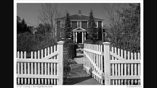
These were images of nice homely houses because i wanted to have the last scene to be a nice one that my character would be happy to come home to. I was going to add a picket fence at the front but it seemed better to not have one as it seems the character is closer to the door and therefore closer to his family and being home. I liked the front view the best as having a long garden would make the last scene too long but also too small to show his family waiting for him.

Process&Production- Style Guide

Style Guide


This is the style guide i have been building as i create each scene. I look at these if i need to remind myself of what the style of my animation look like, i also referenced this for my character to try and keep him looking the same throughout. The bottom one was created last as it was a scene i left till the end but i used a lot more brown tones so it looked warmer and the inside looked brighter, this was from feedback i had received from peers, telling me it would make the story of him getting happy at the end come together more and be more obvious.

In the first scene with the factories, the buildings stay the same but the smoke i will create on a separate layer so it looks like it is coming out of the machines and is more affective.

Wednesday, 13 January 2016

Process&Production- How the animation is coming along

Animation Coming Along

I am now a month into animating and have come very far with the process. It has taken a lot longer than expected with doing each slide and having to draw the same thing over and over but i have completed quite a lot from the first 3/4 of the animation as a whole.

The hand scene i took out when i was just starting to animate was replaced with hands like the ones in my sketches. These are to show the pain in the guys hands but also the wedding ring that will be on his finger. Here i have just quickly sketched out what i want the hands to be placed like and i have done them just so i know what goes in this section as well as keeping in my head what i want them to look like.
This is the video that i will be using as it shows the hands at a good size but also leaves room behind for me to place the guys feet to it looks like he is looking down at them in the factory. I have made the hands move purposely slow so i can let the audience really see the detail as well as the injuries he has.

Process&Production- Title safe zone


Title Safe Zone


After fully completing the title i realised that the title was not in the safe zone that is shown in the blue guides at the beginning when you first complete the crating of a document. This was a very tedious task of fixing this as i needed to go though and individually move all of the words across so they fit into the guides. As i did them all on separate layers i needed to move the words by inches each time.

This was a task i didn't need to do but just in case the animation is put on a screen that cuts an inch of the sides, this ensures that all the words fit and can be seen on every scene.

Process&Production-Idea Changes & Development


Idea Changes and Development

These two scenes are ones i have included in my storyboard and anamatic, But as i carried on animating i found i did not like the scene with the stairs as there was no need to show this and the top one i want to keep in but i found another way to display the hands to make the point of this scene come across better.
I really like the sketch i did in my development stage so instead of the guy wiping his hands of oil and dirt i am going to change this so that the guy showed his hands to be cut and injured, as well as dirty. I feel this will show how hard the guy works compared to just wiping his hands from dirt. 
For this scene, i went into painting a background and setting the scene but i felt this was a scene i could remove and have another scene that was more important to be made longer and show more detail. I also found it hard to have a character walk down the stairs within two seconds and have him go a good amount and not just two steps which i think would have ended up happening if i fully animated this.

Process&Production- Anamatic

Anamatic

This is the anamatic so i can see how long each section of my animation needs to be and what it looks like as a whole. I have not added sound to this as i need the machines to be moving to get the spacing of the sounds correct. This is just a basic anamatic to help tell where i'm drawing and what i'm doing.

One struggle i will have, will be making this animation all interesting and making sure i keep the interest of the audience. This is why i am waiting to add sound, as this really helps to keep the interest of the audience. This anamatic is also hard to watch because it is all still. As i add in more and more motion, it will be easier to watch and will become interesting.

Tuesday, 12 January 2016

Process&Production-Sound

The Other Side- Sounds 

As my animation is set in a factory, which is why the sounds i have found are either tools that fit the machinery i am showing, or it is general noise from within a factory.

I also have the scenes towards the end that are not within a factory, so i have found car sounds, doors opening and walking to show my character leaving and going to work but also stepping out the car.

These are all important as it sets atmosphere and makes the animation a whole lot more believable. I am also adding sound to draw people in and keep them interested when watching my animation so they cant get bored.

Process&Production- Storyboard

The Other Side Storyboard


These are the storyboards for my animation. I have written in movements of scenes, sounds and whats going on so people looking at the board for the first time will be able to follow the story and know whats going on and what needs to be done when adding sounds and movements. I have done these in pen as i wanted it to be bold but easy to understand. My colour pallet is also backs, greys and browns so these colours are easy to see on the board.

This is now going to be added to an anamatic with sounds so my animation can again, be easier to understand and also gives me a head start into the animation process.

Sunday, 10 January 2016

Process&Production-Starting to animate

Starting to Animate


I am 2 weeks into animating and have been finding it hard to keep the drawings looking like the same character and adding in the titles. As the animation needs to be 25 seconds at 24fps, i need to work fast to get my aniamtion complete but also to a quality i am satisfied with. 

There are many things i need to improve on, the guy pulling the lever changes size as well as the machine so i will have to change this. It happened during me following the onion skin tracing, i need to watch this in the future by working more carefully with drawing each slide by tracing as i went to far over the lines and that is how my character got bigger and bigger.

When the guy is turning the cog, it looks hard to follow but when it comes to adding colour, it will all come together and you will be able to follow what is happening. This is also apparent with some of the backgrounds which i will also improve.

One the walking scenes, i will add moving grass so the character does not stand out so much but also looks more 3D and adds to the atmosphere of the overall sequence.I have not been able to move the ones at the end yet as i have been doing the machines first as they are the ones that included the most movement.

Process&Production-Presentation Feedback

The Other Side- Presentation & Feedback

After creating my anamatic i presented my work to my peers so i could get feedback on what i have done and what i could add to make my ideas better.

This presentation went well as everyone had very constructive feedback. One was to add more warm tones towards the end of the animation to show my character is happy at the end. I was already considering this so i found that others also though it was a good idea, so i will include this is my final animation.

Some worried the animation would be too long and could get boring for the viewer/ audience. I agree with both of these and am not against cutting scenes to either be shorter if they are not relevant, i can cut them altogether. Also to make the animation interesting i will add music and lots of sounds so the animation will flow and the audience can be drawn in and keep the interests. I was also told to show a lot of motion in my machines and character, this will make it all come together and will tie in each scene.  

After this presentation i found many things i was able to improve on my animation. So overall i found showing my peers what i am doing to be very useful and informative.

Friday, 25 December 2015

Visual Language- Set/scene/Sequence-Studio Brief 1-18/24

Exploring Mediums& Characters

 This piece was a very experimental piece as i wanted to see if i could get the effect of white pencil and black to show on paper that was not black. I did not have any black paper which is why i used this kind, although i do like how it turned out as the white showed up a lot more than i had thought it would so it shows the shading on the skin that i wanted and also the face tones needed to make the person look more lifelike. If i had black paper i would have liked to see what i could have tried out and see if it would look any better, and the black outline would have been the background to would make it all more defined.
 I really like this piece as its always joked that a banana would be used instead of a gun when trying to intimidate someone so i liked drawing this and thinking of scenarios and contexts for this piece. I made the banana blue as a different take on the whole look but i rather like how it stands out and looks so bold and the textures and tones can be seen. I am also happy with how the hand came out as the brown tones add shapes and a 3D look that a hand needs, but it also looks like its really holding the banana.
 This piece didn't turn out as good as i hoped. I drew a banana as a gentleman where his peel is his suit. I ruined this piece when i used ball point pen to colour it as it ended up too dark so you cant see the detail i added underneath. The actual banana is still yellow but every other part could have been a lot better if it was in a different medium i am better at using.

On the right there are a pair of clogs that are bananas. These want good as i like using the coloured ball point pens but i think if i had done the top one on a different angle, they would have looked better overall and more like a pair of shoes on top of each other.
The top banana was done in pen and acrylic style pens. These were to try out the medium of paint, but they were very hard to control so the piece isn't as tidy as i would have hoped but i do like the banana itself in its sexual pose as it has peeled itself so it suggests a sexual scenario which is often brought up when people think of bananas, so i wanted to show this side of the theme.

Here i have also done a small banana phone in grey coloured pencil tones. I like this old style of phone as it is a classic design but also adds interesting shapes that phones these days will not. I also think this piece is obvious to the audience as you can clearly see the banana on top so it carries on with my topic of the fruit.

Visual Language- Set/scene/Sequence-Studio Brief 1- 12/24

 Exploring Mediums& Characters

I do love how this turned out. I was looking at Andy Warhol's famous design as inspiration and tried to show the bold black colour against the pale yellow which i feel is successful. I used coloured ball point pens which i ended up really liking as they were very easy and soft to use which made the piece easier to complete, and i could try to get the effects like Andy Warhol did for his design.
 This was a very playful character that i saw that i wanted to try in chalk pastels. It turned out very good as the chalk made the banana dolphin very smooth which makes it look more like a banana than if it was scratchy, like i've done in other medium. It was also a very quick design to do in this medium so if i were to have many designs to do in the future for a project, this medium makes it easy to get lots produced and still look a good quality.I like this character as you can still see it is a banana but the dolphin shape and features are still shown.
 This piece was done with coloured pencil, chalk and coloured ball point pen. I did this design as monkeys eat bananas and this makes it easy for viewers to see it is along the theme of bananas. I was just testing mediums in this piece because i do like mixing medias in art so this is what i will do for the final designs and storyboard.
 This tonal pencil design is of a banana milkshake to show a different form of banana. The tonal pencil made it easier to add light where needed and to get a glass effect but i could have made this piece better by spending more time on it but i wanted to move on to test other mediums and designs to try to find a good design to do for the final extended piece.
The umbrella above is made of banana peel with the handle being the top of the banana. This piece is watercolour but the paper is not good at soaking in moisture so it didn't take to the water properly but it just added to the bruised patchy look some bananas get. This is also just to see where i can take the idea of the banana shape.

The swan at the very bottom is pen and ink but it again didnt take much of the water so the pen wasnt able to be mixed very well but i still like the idea i created as the character looks like a happy swan so i could design a story about the context of why it is happy. I would have done it on better paper so if i were to do this again i would change it and also add more water to get the pen to create more tones and shades.

Visual Language- Set/scene/Sequence-Studio Brief 1-6/24

Exploring Mediums& Characters

Realistic Bananas

These bananas i drew first as i wanted to capture what they looked like in a realistic way. This was showing that they looked like peeled, in a bunch and when sliced, so i could really understand their shapes, tones, colours, textures and sizes.

The top one is done in pen as i wanted to show tones and shading as well as texture which i have done with cross hatching and layering up the pen in areas that are darker. This could have been done better if i had used better paper as the type i was using took in no moisture from the pen so it didn't bleed or cover the paper as easily which would have made it look better.

The next one down is done in tonal pencil as i wanted to see how i could use the pencil to get the texture that you get on the inside of the peel, that is ridged and has lines going down the centre to each end.  I also added in the bruises and black marks so the skin it more accurate. I did like some of the effects i got using the pencil as it is easy to gain effects and shading that it could be harder using another medium.
The top banana is coloured pencil that is of a bunch so i could see how the colours could mould together as well as colours be shown. The shading on the underside and back bananas were golden brown as they needed to look more 3D and from the fruit i had seen, this was the colour it changed. I dont like the coloured pencil as i find it hard to merge the colours together fully so it looks smooth so in future i would use a different medium for this image so it can look more life like.

The banana pieces have been done in pen. As i only had brown tones, I have had to try to get it to look as much like banana as possible. This worked rather well as the lines and shading are very clear and make it look round. Although i would have changed the whole position, as it looks too much like it is floating and misplaced. This is why they dont look as realistic as possible.
The top one of these two is ball point pen. I found this medium good to add the scratchy texture of the skin but hard to get the tones light where they needed to be and getting the 3D effect needed for the pieces at the back. 

This bottom one is in watercolour and i liked the overall look because i could get the mixture of yellow, orange and brown tones throughout. This shape wasn't as realistic as the others but the overall look is because of the colours and bruises, and if the shape was a lot thinner at the top it would be more like the shape needed but i still think this style was a good one to try.

Visual Language- Set/Series/Sequence- Studio Brief 1-Mood Board

Mood Board


After looking at my mind map i decided to look on Pintrest and Google Images for pictures to do with bananas and things i could turn into bananas from the shapes. I have stuck to using mostly yellow as it is the main colour people see when it comes to bananas so it will help people to understand my theme and if the images are quite out there, the colour will hopefully help.

i have used each one of these images, either to test mediums, use them in a different context and add them to characters or make them into characters. I felt i needed to do this so i could see what the peel looked like and to get a realistic shape when i was doing a realistic banana, but also to help me find more influences and more banana shapes.


Visual Language-Set/Series/Sequence-Studio Brief 1-mind map ideas

Mind Map of Ideas

This is a mind map i have done for all of my ideas after i have come up with when given the word Banana. I need 24 ideas so i will use most of these ideas so i had to write them down but doing so, it gave me more ideas that sprang from the first ones so this process helped me to get all my thoughts together.

I will not know my idea for the storyboard until i see what i have drawn as i need to see what i have produced to see which one i would like to pick as a final. When looking at this map i was thinking of mediums and angles i could draw each idea as, this helped to decide what they were going to look like in my head so i had more ease when it came to doing them.

Monday, 21 December 2015

Visual Language-Set/Series/Sequence-Studio Brief 1- Brief

Set/Series/Sequence


This is a new brief we have been set that is to help keep on top of drawing skills. This brief was to get a word, which mine was Banana, then to draw 24 pictures associated with that word. Then from that 24 choose one design and draw 12 more drawings from it before designing a short storyboard with 6-12 frames.

I am planning to use lots of different mediums and textures to help me show all the different styles i like to use when drawing and designing. I will also look at different frame angles while drawing when i am doing the storyboard so the overall piece will be more interesting for the viewer.

As the storyboard is only short, as i go though drawing and looking at different ways to draw a banana, I need to look at how i can make either a character or scenario for it to be interesting and show a story.