Friday 25 December 2015

Visual Language- Set/scene/Sequence-Studio Brief 1-18/24

Exploring Mediums& Characters

 This piece was a very experimental piece as i wanted to see if i could get the effect of white pencil and black to show on paper that was not black. I did not have any black paper which is why i used this kind, although i do like how it turned out as the white showed up a lot more than i had thought it would so it shows the shading on the skin that i wanted and also the face tones needed to make the person look more lifelike. If i had black paper i would have liked to see what i could have tried out and see if it would look any better, and the black outline would have been the background to would make it all more defined.
 I really like this piece as its always joked that a banana would be used instead of a gun when trying to intimidate someone so i liked drawing this and thinking of scenarios and contexts for this piece. I made the banana blue as a different take on the whole look but i rather like how it stands out and looks so bold and the textures and tones can be seen. I am also happy with how the hand came out as the brown tones add shapes and a 3D look that a hand needs, but it also looks like its really holding the banana.
 This piece didn't turn out as good as i hoped. I drew a banana as a gentleman where his peel is his suit. I ruined this piece when i used ball point pen to colour it as it ended up too dark so you cant see the detail i added underneath. The actual banana is still yellow but every other part could have been a lot better if it was in a different medium i am better at using.

On the right there are a pair of clogs that are bananas. These want good as i like using the coloured ball point pens but i think if i had done the top one on a different angle, they would have looked better overall and more like a pair of shoes on top of each other.
The top banana was done in pen and acrylic style pens. These were to try out the medium of paint, but they were very hard to control so the piece isn't as tidy as i would have hoped but i do like the banana itself in its sexual pose as it has peeled itself so it suggests a sexual scenario which is often brought up when people think of bananas, so i wanted to show this side of the theme.

Here i have also done a small banana phone in grey coloured pencil tones. I like this old style of phone as it is a classic design but also adds interesting shapes that phones these days will not. I also think this piece is obvious to the audience as you can clearly see the banana on top so it carries on with my topic of the fruit.

Visual Language- Set/scene/Sequence-Studio Brief 1- 12/24

 Exploring Mediums& Characters

I do love how this turned out. I was looking at Andy Warhol's famous design as inspiration and tried to show the bold black colour against the pale yellow which i feel is successful. I used coloured ball point pens which i ended up really liking as they were very easy and soft to use which made the piece easier to complete, and i could try to get the effects like Andy Warhol did for his design.
 This was a very playful character that i saw that i wanted to try in chalk pastels. It turned out very good as the chalk made the banana dolphin very smooth which makes it look more like a banana than if it was scratchy, like i've done in other medium. It was also a very quick design to do in this medium so if i were to have many designs to do in the future for a project, this medium makes it easy to get lots produced and still look a good quality.I like this character as you can still see it is a banana but the dolphin shape and features are still shown.
 This piece was done with coloured pencil, chalk and coloured ball point pen. I did this design as monkeys eat bananas and this makes it easy for viewers to see it is along the theme of bananas. I was just testing mediums in this piece because i do like mixing medias in art so this is what i will do for the final designs and storyboard.
 This tonal pencil design is of a banana milkshake to show a different form of banana. The tonal pencil made it easier to add light where needed and to get a glass effect but i could have made this piece better by spending more time on it but i wanted to move on to test other mediums and designs to try to find a good design to do for the final extended piece.
The umbrella above is made of banana peel with the handle being the top of the banana. This piece is watercolour but the paper is not good at soaking in moisture so it didn't take to the water properly but it just added to the bruised patchy look some bananas get. This is also just to see where i can take the idea of the banana shape.

The swan at the very bottom is pen and ink but it again didnt take much of the water so the pen wasnt able to be mixed very well but i still like the idea i created as the character looks like a happy swan so i could design a story about the context of why it is happy. I would have done it on better paper so if i were to do this again i would change it and also add more water to get the pen to create more tones and shades.

Visual Language- Set/scene/Sequence-Studio Brief 1-6/24

Exploring Mediums& Characters

Realistic Bananas

These bananas i drew first as i wanted to capture what they looked like in a realistic way. This was showing that they looked like peeled, in a bunch and when sliced, so i could really understand their shapes, tones, colours, textures and sizes.

The top one is done in pen as i wanted to show tones and shading as well as texture which i have done with cross hatching and layering up the pen in areas that are darker. This could have been done better if i had used better paper as the type i was using took in no moisture from the pen so it didn't bleed or cover the paper as easily which would have made it look better.

The next one down is done in tonal pencil as i wanted to see how i could use the pencil to get the texture that you get on the inside of the peel, that is ridged and has lines going down the centre to each end.  I also added in the bruises and black marks so the skin it more accurate. I did like some of the effects i got using the pencil as it is easy to gain effects and shading that it could be harder using another medium.
The top banana is coloured pencil that is of a bunch so i could see how the colours could mould together as well as colours be shown. The shading on the underside and back bananas were golden brown as they needed to look more 3D and from the fruit i had seen, this was the colour it changed. I dont like the coloured pencil as i find it hard to merge the colours together fully so it looks smooth so in future i would use a different medium for this image so it can look more life like.

The banana pieces have been done in pen. As i only had brown tones, I have had to try to get it to look as much like banana as possible. This worked rather well as the lines and shading are very clear and make it look round. Although i would have changed the whole position, as it looks too much like it is floating and misplaced. This is why they dont look as realistic as possible.
The top one of these two is ball point pen. I found this medium good to add the scratchy texture of the skin but hard to get the tones light where they needed to be and getting the 3D effect needed for the pieces at the back. 

This bottom one is in watercolour and i liked the overall look because i could get the mixture of yellow, orange and brown tones throughout. This shape wasn't as realistic as the others but the overall look is because of the colours and bruises, and if the shape was a lot thinner at the top it would be more like the shape needed but i still think this style was a good one to try.

Visual Language- Set/Series/Sequence- Studio Brief 1-Mood Board

Mood Board


After looking at my mind map i decided to look on Pintrest and Google Images for pictures to do with bananas and things i could turn into bananas from the shapes. I have stuck to using mostly yellow as it is the main colour people see when it comes to bananas so it will help people to understand my theme and if the images are quite out there, the colour will hopefully help.

i have used each one of these images, either to test mediums, use them in a different context and add them to characters or make them into characters. I felt i needed to do this so i could see what the peel looked like and to get a realistic shape when i was doing a realistic banana, but also to help me find more influences and more banana shapes.


Visual Language-Set/Series/Sequence-Studio Brief 1-mind map ideas

Mind Map of Ideas

This is a mind map i have done for all of my ideas after i have come up with when given the word Banana. I need 24 ideas so i will use most of these ideas so i had to write them down but doing so, it gave me more ideas that sprang from the first ones so this process helped me to get all my thoughts together.

I will not know my idea for the storyboard until i see what i have drawn as i need to see what i have produced to see which one i would like to pick as a final. When looking at this map i was thinking of mediums and angles i could draw each idea as, this helped to decide what they were going to look like in my head so i had more ease when it came to doing them.

Monday 21 December 2015

Visual Language-Set/Series/Sequence-Studio Brief 1- Brief

Set/Series/Sequence


This is a new brief we have been set that is to help keep on top of drawing skills. This brief was to get a word, which mine was Banana, then to draw 24 pictures associated with that word. Then from that 24 choose one design and draw 12 more drawings from it before designing a short storyboard with 6-12 frames.

I am planning to use lots of different mediums and textures to help me show all the different styles i like to use when drawing and designing. I will also look at different frame angles while drawing when i am doing the storyboard so the overall piece will be more interesting for the viewer.

As the storyboard is only short, as i go though drawing and looking at different ways to draw a banana, I need to look at how i can make either a character or scenario for it to be interesting and show a story.

Monday 23 November 2015

Process&Production-The Other Side- Setting Ideas

Setting Ideas

This is my first ideas for environment and character in my sketch book. I needed to show that the male works in a factory so i needed shots of what it looks like as well as him interacting with equipment and showing the toll it is taking on him.

I have shown the guy to have cuts and bandages on his hand because of him working so hard but also because factories weren't very safe a few years ago so it more set in those days as he is worked to the bone and carries on even with cuts and scrapes.

I think the environment is very important because i need to show it as being draining and tough so the message of the dad being a hard worker can be carried across until the end. I have also done a small drawing of what i will try to make the drive home look like with the ground all coming towards the car and therefore the camera.

Sunday 22 November 2015

Process&Production- The Other Side- Mood Board

Mood Board


This mood board is showing my thought process in the form of images. I have been trying to figure out what the character should look like and in my head he is a typical dad who is big and burley who is hard working but its hard to get an idea across when there are no images to back it up. This is why i have done this mood board.

I have also looked at factory settings and machines so i can develop the scenes around accurate machines and therefore make the idea easier to follow and understand. I have gone for my character being tough and strong but when he sees his family at the end he reverts to a teddy bear who is happy and sees the reason he works so hard in them. This is why on the mood board i have families and people hugging.

At the bottom i have decided upon my colour chart being black and white as this will make it easier for me to add the details i want and add subtle colours where i see relevant, like the home having a more orange warm colour as its a happy place for him to go to.


Process&Production- The Other Side- Mind Map

Mind Map

After getting the brief I had to get all my ideas written down so i can figure out which one i would like to do for the final animation.
This is the mind map i produced of all my ideas. I was torn between 3;The other side of life, The other side of a hard worker and The other side of a personality. These three i had come up with a full idea for both and where i could go with it.
I had to try to figure out which one i could easily show within the 25 seconds and which one i would find best to do in this space of time. After setting them all out i found i was drawn to do 'The other side of a hard worker' as this one was clearest in my mind for what i could do and show.

This process has helped me because my original idea which i thought of first was 'The other side of life' where i could show someone losing someone but i found i could only picture the beginning and end of that story so the hard worker story was more thought out.

Process&Production-The Other Side-Brief

The Other Side

The new brief we have been given, is to produce a 25 second animation in 2D that shows Knowledge and understanding, Cognitive skills, Practical & Professional skills and Key Transferable skills.This animation must be computer based so i will produce it on Photoshop that will be 24 frames per second on two's. To work out how long it must be for me, it is 300 Frames.

As soon as we were given the brief i had many ideas coming to mind so my next step is to produce a mind map of what possible animation i could create, could be about. After i will get tarted on getting a full idea formed and reference images together in a mood board so i can understand my idea and what i want to produce.

Friday 6 November 2015

Studio Brief 4- Apply- Final Animation & Evaluation

Final Animation & Evaluation


Here is my final animation that is in the genre of love. I found this task to be very interesting because i have done it in hand drawn animation style. I found this to be very difficult overall because you have to draw each slide, and when it is going at 12 frames per seconds, it all goes by very quickly.

I found the run cycle to be quite hard because of all the different frames needed for each body movements. When drawing these, i decided to leave them looking sketchy and rough because i like the overall effect it gives and the tones created from the slightly sepia toned background and the black and white characters.

The purpose of this animation is to show love. This is shown by the two lovers running into each others embrace which is quite obvious. I also added the spiralling effect because when you love someone you entangle yourself with them and become one, this is why they are shown fluidly spinning and merging into a heart shape before hitting the ground where they re-emerge.

I found for this task we were given enough time because it was just under 2 weeks, the only time i struggled with time was trying to get it all scanned in and edited so it was to a good standard that i am happy with. 

This does not mean i would not have improvements. I would colour the characters with a pen and ink lining so that when they merge the pen and colours all mix so its like the couple really do become one at some point so it adds to the overall story i am trying to portray. I do feel the theme does come across however because its very clear they are a couple and are in love therefore showing the theme.

I think next time i would do this on Photoshop, This is because the animation paper is very hard to keep neat and tidy, with no creases or smudges, so if it was on the computer it would be clean and a lot easier to draw and edit each stage as i could do a whole lot more with the software that i could not do on the paper with such a short amount of time.

I think something that went wrong to begin with would be that i worked out that from my design, i would finish early with a few more seconds that i needed to do. I amended this by adding more to my overall ending so that the couple re-emerge out of the pool on the floor. I do prefer this ending compared to them just being fluid as it is more of a complete ending and not something that could look incomplete.

Overall i am happy that i completed an animation that was 5 seconds long, at 12 fps and that was something that i was proud of. Even with many things to improve on, as a first attempt at a full animation with a story, I think i did well.

Studio Brief 4- Apply- Testing

Testing

As hand draw means you cannot see the overall finished animation till the end, i used a camera to take pictures and then uploaded them to Dragon Frame which put them all together. This is so i can see what i have been doing so far and what i need to look at.
This was my first test that was for the people running to each other as i wanted to see if my run cycle would work and look correct. I wasn't sure how it would turn out because it was a lot of frames yet still didn't take very long in seconds so i was hoping it wouldn't go too fast.

I this did turn out ok because i could see what was happening but also, i found i liked the ending where they come together because the male bends down slightly to meet her which i was hoping would come though and it does.

This was my second test that looked at the couple running to each other, when they spin and when they spin up and turn to liquid in a heart shape. I really liked doing the water aspect as i liked the fluid motion i was able to give it. I liked how it ended up as well as it moved at the right speed but you could also see the water splashes and the heart shape is very clear.

When i was using the camera, the way it was set up meant that it cut off the top section but since it was a test it didn't matter because i could still clearly see the whole thing but i will scan these images in when i am finished so the whole thing can be seen and the images wouldn't be drowned out by the light being too bright.
This is my final test as this is the end of my animation. This is where the couple re-emerge from the pool on the ground. I like how this turned out but i would have liked to see it without the light being to strong again but i still couldn't change the way it came out. This was still ok for the tests but i will now scan in the whole thing and then edit them in photoshop so i can make them look how i want.

Studio Brief 4- Apply- Development

Development

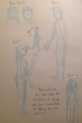
This was my page for characters. I knew what i wanted them to look like after seeing my different inspirations and what i mentally wanted them to look like. As the animation is so many frames and i would have to hand draw each one in a small amount of time, I like this type of style as well as it shows people in such a basic form so people have to pay attention to what is happening. This is also so i can pay close attention to changing the forms and shapes so it looks fluid, smooth and the story is seen.

I needed to storyboard my animation because i worked out that my original idea would be too quick because i thought it would last longer but it is actually short as we are working at 12 frames per second. This is why i added more to the love story and had them being 'reformed' after the liquid has landed. Now i feel there is more to the story that is interesting and adds to the story.

Wednesday 4 November 2015

Studio Brief 3- Explore- Frame by Frame animation

Frame by Frame Animation


This is a simple Frame by Frame animation that i have created to just sample what it is like designing an animation on Photoshop using the animation timeline. This is the final outcome from the short amount of time that i had to complete this task. As you can see if does not end correctly because i had trouble adding any more frames as they kept on getting mixed up and deleted so i had to leave it ending like this. 

Overall i was quite confused to begin with when using this type of animating but after doing the first 5 i got the hang of it and found it quite easy to produce. I have also added a 3D effect with highlights that change when the ball goes around the room as this makes it look a lot more realistic compared to if it was just solid.

 
This is a video of someone who has done a simple frame by frame looping animation, this is just a short gif style animation that loops very quickly but you can clearly see the stages they have taken when creating this frame by frame animation.

Overall i like the way they have done this animation as it looks smooth and because they used onion skinning, each slide successfully lines up. I will use this type of animating in the future as you can get an animation produced in a good amount of time and you can make very easy changes very simply.


Monday 2 November 2015

Studio Brief 1- Paperman

Paperman

Paperman is a Walt Disney animation. This is a fairly new release and is the first animation to be produced by Disney that merges hand-drawn and computer-generated animation techniques. This has been found to be very popular as the overall aesthetic of the characters are charming and draw people to them and to get attached to them and their story.

I really love the style that this animation has been done for colours and shading, as the whole thing has been done in black and white where only her lipstick print has been done in red. This really shows how much the colour contrasts with their world. When watching this animation you can really see how different it is when the art style looks like it should be 2D then looks 3D overall so this would have taken such a long time to produce and get correct.

The audience for this animation would be aimed at everyone as Disney movies are aimed at children but the overall concept and theme is grown up enough for adults to enjoy it as well. As it is a love story where he is trying to get her attention and failing as she cannot see the paper planes he is throwing to her. This is what made this animation so popular because it appeals to everyone therefore can be enjoyed and appreciated more.

Studio Brief 3- Explore- Pose & Pose Pendulum

Pose & Pose- Pendulum


This is my pose to pose animation of a pendulum. This was done to see how a testing shot was done and how to plan how to do motion on singular frames. I found this to be a very time consuming task but it really opened my eyes to how difficult the original style of animating was.

I found i had issues with size because if you look at each individual slide when i was drawing them, the ball on the end was changing size and getting bigger and smaller. This was really difficult to maintain because i would think it was the same size but then when running though, i could see a clear difference and had to go back and alter it.
I did a plan before drawing it though because i needed to work out where each pendulum placement needed to go to make it seem like it was moving smoothly. For it going to the right i did it in brown and then for it coming back, i did it in blue. This was so i knew which one went were and what order they go in.

Overall i do think i will use this type of animating as i am able to see just what i need to do and to what stage it needs to get to for it to get completed.
 
This is an video showing 'Pose to Pose' as well as 'Straight Ahead' animation. This was created by Alan Pecker and is showing the difference between the two types and how they differ as i originally got them confused with each other. This is also showing just how i created my pendulum animation and how each step needed to be planned out and in the right place.

Studio Brief 1- Contre Temps

Contre Temps

This animation was created by The CGBros, by the Contre Temps Team and was published on Youtube in 2013. This animation was done using effects and paintbrushes that create a watercolour effect before being rendered and having CGI added. It is about an underwater city that has a time of day when the water lowers so one man can go out and collect treasures, which he sees as clocks being his most useful treasure.

This is a beautiful animation that has stunning environments throughout as well as having nice character designs and overall visual effects that draw the audience in and create interest in the story. The character design shows the male to have sharp squared features as he has been hardened from his time alone whereas the little girl is innocent so her features are soft and smooth, showing the designs to be well thought out.

I think the media used and the lighting is used to show dramatic effects which adds to the animation itself. This is shown when the tide goes out and the world is calm, refreshed and beautiful whereas when it comes back in it is dark and sad because once again the man and now the little girl are trapped inside.

Studio Brief 1- Thought of You

Thought of You

This animation is called 'Thought of You' by Ryan Woodward and really peaked my interests when i saw the style in which it is done but also the fluidity of the characters motions within the animation as they are shown to be spiritual, liquid but also moving ribbon that floats lightly around.

The character design in this animation has been done very simply as the body's have sketch lines and circles within them to show they are 3D and simple. Although they also contain different tones, shading and line work which really draws me to the aesthetic, but also makes their movements look all the more effective, when their body is moving along with it surreally.

http://ryanwoodwardart.com/my-works/thought-of-you/  - This link is showing you how it was made. Real dancers were used for him to get the correct look of each move that was drawn which is why this animation look so effective as you can tell he really researched into what dancers move like and how they look doing it.

This animation is trying to tell a love story where she is spiritually with him. He is fighting to get to her but she keeps pulling away until she finally wants to be with him but its took late and he has given in. You can clearly see this story as she is in a different colour to him and is only the same colour at the end when he walks away.

This is why i like this animation so much as it hold so much emotion when no words are spoken so it shows just how effective animation can be when it is silent.

Studio Brief 1- Solipsist

Solipsist


This stunning animation was created by Andrew Huang, as well as a massive crew of people to get this final outcome. The way this animation was created was a very difficult and time consuming but payed off in the final outcome.

The way it was done, seen in the clip below, was that they took small clips of film where the girls were swaying, then at the same time the animators were digital moving the fabric and insect things on them, like when they take over their faces, it was done right then and there. 

This is why this animation is so impressive, because i've never seen one done like that where it was all done at the same time which is why this all took so long. The way they have been designed though it very clever, they are clearly been taken over by a monsteresque, insect thing, but its just fabric that they are using so this is why it is interesting. 

Studio Brief 4- Apply- First Storyboards

Apply- Starting Storyboard 

I wanted to just jot down some basic storyboards so i could visually see what my plan was and what i basically wanted to happen. This shows what i am wanting the couple to do when they are stretching up and spinning before turning more and more into liquid in the final heart shape.

Studio Brief 4 - Apply- References

Apply- Movement Reference

To make my animation more realistic and easier for me to produce i have looked at the way couples run towards each other in the stereotypical cheesy fashion because that is how the beginning of mine starts because you can instantly tell its love. I chose to find these clips because when i animate them they wont be as cheesy because my characters will try to have such fluid motions and they will be designed well. Slow Motion couple -Here is a link to one i have been looking at as it is slow so i can see all of the movements from each slide if it were an animation.

I have also found another similar one, Couples running to each other, This is so i can compare the two and whichever makes the animation work best, i can use more. Both are good as one spins slightly and one is lifted so i can look at both and see which i prefer.

This song of Ed Sheeran's 'Thinking Out Loud' was perfect to look at dancing and body movements so i could see how the couple could approach each other and how they can spin into the spiral that will turn and stretch them into water.
This is another reference by Eadweard Muybridge who studied cycles of movement as he shows people running and walking in images so i could draw the running knowing the positions are all correct and in the right place.

This type of referencing is overall very useful to me personally as it helps me see just how to draw certain things and how to plan each step and what will come up next.

Studio Brief 4- Apply- References

Apply- Animation Inspirations


This is one of the main inspirations i have found which is called 'Thought of You' by Ryan Woodward. I came across this animation a few days after i thought of the idea for my animation so it was perfect to show what i was imagining for my idea. As i wanted some simple characters that move very fluidly to come together in a tale of romance.

When i take all the pictures of this animation i will see if i can change the lighting to try to give it a more sepia tone but if not i will add colour to the characters so much like their light and dark i will have one light and pale coloured and the other dark with a dark colour attached to it, so when they come together in their spiralling dance, I can merge the colours and when they turn into fluid the colour can be the mix of the two.

This animation is very moving about how two people grew up together and fell in love. This is again set out like a form of dance where the camera is tracking their movements which makes this more visually stunning. I also really like the fact is is chalk and coloured pencil on dark blue backgrounds.

This animation is called Duet by Glen Keane and i was mostly inspired by the end spin as the couple in my animation are coming together and spinning in a sort of dance so i need to see how this was done, this is why this is helpful.

Studio Brief 4- Apply- Research

Apply- Research Planning and Ideas


This is my next stage where i have wrote clear titles for each section that i have to plan. For the concept i needed to just write which one i am going to follow and which i need to design for. My characters need to have clear aesthetics and designs as they have to be the same all the way though and cannot change, but also i want them to be interesting so the audience can get attached to them and keep interest in my design.

My method that i want to use would be pen and ink but i will initially draw them in pen and fully complete it and then add colour and water if the effects could look better. I wanted to do hand drawn as i wanted to draw a full animation so i could try out the method and understand how to do them in the old style of how animations were created.

For inspiration and research i will be looking at couples running towards each other as well as people dancing and fluid animations. I have found some animations that have inspired me so i will talk about how they have influenced me in my next blog post.This page was just so i could plan what i needed to do and what i needed to remember about this idea.


Studio Brief 4- Apply-Story ideas

Apply- Story generating


This is my next stage of planning as i was thinking of each individual title and what story i could do for each one. Some i found to be too hard to do, as they would be too hard to complete in the time frame and as this is the first animation i am doing so i want it to be completed. After writing all of these options, i found i like Love as a genre to follow and the first story i wrote down about two couples running towards each other then fluidly exploding and swirling into a water heart at the end.

My next stage is going to be about planning individual aspects of this task, like the research i need to do and character design as i need to be able to visualise the animation more clearly. I also found that i am radiating towards doing hand drawings so i need to be able to think about how i could draw each frame for each stage.


Studio Brief 4- Apply- Notes and Initial thougths

Apply Brief

These are my notes that i have taken down about this brief. When told that the animation can be about anything, we were given themes or genres to follow; Love, Hate, Lateness, Surprise, Longing, Happiness and Fear. When first given this brief i instantly had ideas that i could possibly do but i had to go away and think about the fact we have been given 2 weeks and it must be 5-10 seconds long, so i dont want to make it to over complicated and not be able to finish it to how i want it.

When told this we were also given the opportunity to do any type of animation, it could be Pixilation, Hand drawn or even on the computer. So this really made me think about what it could look like and the story it could tell.

Saturday 31 October 2015

Studio Brief 1- Reaping for Dummies

Reaping for Dummies


This animation was created by CGI VFX Animated Shorts by some graduation students from their 3D design and animation course and was published in 2013. The students are from Norway and are called; Jonas Martin Larsen, Øyvind Fiksdal, Eilef Sandnæs, Eskild Carlsen & Yvonne EngbrÃ¥ten.

This animation reminds me of the Looney Tunes 'Wile E. Coyote and The Road Runner' where the two main characters could chase each other for eternity but never catch each other. This is what makes this animation funny but also really makes you get attached to the characters. You start out not liking the smaller character as he is trying to kill the reaper who comes across really nice yet you start to like him when you realise he is trying to kills him too so its an even fight.

The character design of these two character is very well done because they wanted the reaper to be tall and thin, so they really accentuated his lankiness so he is all bone with skin over the top. With the smaller character they wanted him to be short, they then made him about 2ft tall and quite round which is a good contrast to the reaper. This is why i like them as they are very opposite extremes of each other.

Friday 30 October 2015

Studio Brief 1- Out of Bounds

Out of Bounds

This is an animation created in Denmark by Animation Workshop. I chose to look at this animation because it really speaks volumes with the character they have designed and used. The person in this animation has severe OCD, where his life must run in and must follow a schedule. I really love this because people never get to see just how much people with mental health issues have to go though on a daily basis. This is an extreme yet it gets across his struggles.

I always love these types of animations as they have a purpose, to portray this characters life as a struggle is this animations job to make the audience to understand. The body language of this is also important. The animators must have really understood what was going on in his head when certain things happen as his rocking body, arms used as barriers to protect him, moving houses to distort the world and banding of the head to keep him in reality and feeling safe. Never before has i seen this animated which is amazing to see.

I think the message overall is telling people to not judge people so easily as you don't know what they are going though, it is also trying to point out that you have to be kind like his neighbour, as someone could need help but not be able to ask for it. This animation really makes the audience think of mental health which is what I'm very interested in creating myself, so my animations could have really meaning and purpose like this one does.

Studio Brief 3- Explore- Pixilation Animation and Evaluation

Final Pixilation and Evaluation


This is my final pixilation animation. I followed my ideas and storyboard about wanting to film an animation that was about a moving mannequin where its wondering about but then the owner comes home and cannot know it is able to move. Out of the animation themes i chose Lost and Found as my mannequin needed to hide and stay hidden from the owner so its like they have to be lost so they are not found.

I really like doing this pixilation as i had never done one before but i came across many fault and many issues that need improving if i were to do it again. I filmed this using my phone camera as i did not have a tripod so this made all the images come out overly jittery which is something i would change next time as i will make sure it is on a stand so that it is overall smoother, but also easier to understand and see what is happening.

Another big problem i found when i came to uploading my images was that i was told that when filming i needed to film in landscape instead of portrait which i had not realised so my images were the wrong shape. This is also why i ran into the issue with merging videos with my pixilation, they were filmed the wrong way so when the animation plays they are changing shape and getting smaller. This is very noticeable so i was angry that i could not change this when it came to putting it all together.

I did like that when it was presented in front of the peers that they liked the comic effect that the throwing of the mannequin added to the pixilation. As it was very un realistic and just a still mannequin being clearly thrown, it created humour and entertainment. I'm glad i included this but i am still sad it came out smaller than expected.

I also found i was able to use good camera angles, i used more in this pixilation then i did when storyboarding for Jack and Jill as i found more opportunities to add them into the shots and create a more visually interesting animation overall.

I don't know if i will use pixilation in the future or more go for stop motion but if i do use it i will change these errors with the filming and angles so it is more professional and just looks smoother with connecting frames. As a first pixilation and filming opportunity i felt i did ok and just found many things to add to new opportunities in the future, i will also now go on to find out how to change these issues in the uploading process as i did not know how to change the sizes but if i had more time i would go and ask different people how to do it or go online and find help. So overall this Pixilation has opened my eyes to how difficult and time consuming it can all be and how i can make silly mistakes that affect the final piece so easily.

Sunday 25 October 2015

Studio brief 1- Meet the Pyro

Meet the Pyro- Team Fortress 2

This is an introductory character for a game called 'Team Fortress'. This was created by Team Fortress themselves as it helps promote the new characters for their games by showing their back story but also what they are like as people which is very different as most games dont do that.This animation is also very interesting because the characters come as blank models for certain programmes so they can be the same looking characters that can be manipulated by the creator, so this lets the fans create their own animations and therefor help them promote their game.

These character designs are looking at the stereotypes of the human form, if they're supposed to be buff, they are extremely over buff and if they are skinny, they are overly skinny. This is quite an important thing for the characters though because the game has added mass and weight to the characters which is really good because if they are big they are slower and the skinny characters are swift and light.

This animation is for older people as it includes violence and blood within it, it also includes themes that children would not understand, like mental disorders and mass murder. The message this is all telling is that if you choose to play the game round with this character, he sets everything on fire leaving nothing behind which is all you need to know, this animation is just to comically show a little extra.

Studio Brief 1 - BattleBlock Theater

BattleBlock Theater Opening Cinematic


This is the opening animation for a game called BattleBlock Theater which was created by 'The Behemoth' which have a way of creating characters have little features and yet large amounts of expression. The playful faces and overall intro shows just what the game is like but also that this game and animation is for all ages, The language is very tame and the overall animation is easy to follow but i feel the sarcasm and humour will go over most peoples heads but it makes me laugh ever time so it is a good humorous introduction.

The purpose of this animation is to introduce the game and what it is about, but also introducing some of the main characters that are not yourself as a player and what the overall look of the game is and is like. This media is really good because it is all animated yet aesthetically it looks like paper puppets which is very clever of them to do. This also shows some of the humour, like when you can see the stick when the boat gets turned over.

The character design in this is very easy to do as it is boxes, circles and triangles with very pencil looking drawn faces which makes their aesthetic so desirable as it is so different yet simple. 

Studio Brief 3- Explore- Pixilation- Storyboards

Storyboarding for Pixilation Animation

These are the storyboards i drew for what plan i will follow for the pixilation animation, I wanted to have these to draw from as it is easier to create an animation when you have something to follow with movements and for pose to pose movements.


This animation will mix 2 frame shots and videos so that i can have very fast motions and slow motions in one animation making it more visually interesting. I did a fair amount of planning as i needed to show where the camera angles change and when the characters change so i can understand where dig camera changes happen so i can plan ahead and understand what i'm doing.

Studio Brief 3- Explore- Pixilation- Ideas

Ideas

The task set was to produce a pixilation animation that included one person and must be under one and a half minute and less than 1200 frames. For ideas i had to take a few hours to think of something, what i decided to do was have a moving mannequin in someones bedroom that was moving around when they weren't looking but when they turned around it has to be still.
This was the page i took notes on other pixilating videos that i found i could be inspired by in a presentation showed to us but also my notes on the task itself so i could use it to remember the details of what we were needing to do.

This was my first rough draft of the plot i would follow on the pixilation clip. I needed to think about what would happen and what i wanted to capture. 

This is the mannequin that i will use when doing the animation as its limbs make it easy to maneuver but also i can bring it to life by moving it in lifelike ways to get the audience attached to the character. I also have to get the character to show emotions on whats happening which i feel with be the most difficult task.

Friday 23 October 2015

Studio Brief 1- 'Take on Me'

a-ha- 'Take on Me'

The method of making a music video with rotoscope was most famously done when a-ah created their classic song ' Take on Me' ,which was make famous not only for the song but for the video that accompanies it.

The purpose of this video was to show what it would look like if real people suddenly turned into animated characters, this is interesting because it makes it seem that characters in books and on shows are trapped so it is a deconstructive genre that looks at characters as real people with real lives.

The audience for this would be people who like this form of music as it is a very classic song but for the animation i would say it could be for all ages but older people would understand it is a love story of the guy falling for the woman and breaking out of his world to be in hers in this style of metaphor.

The character designs in this would have been a lot easier to make than doing them from scratch as the use of rotoscope means that the actors were doing all the movement and the characters, which were their animated selves, were drawn on top.

Sunday 18 October 2015

Studio Brief 3- Explore- Pixilation

Pixilation

This method is frequently used by beginners as it is an easier method than most as you only need a camera and a story to go with it. Pixilation can be mixed with film to make it all a lot more fluid as an animation.

This type of animating process is done by taking pictures and much like stop motion, something is being slowly moved with every shot., it is called pixilation as it is with real people and can be mixed with film when needed.

When making pixilations they need to be planned out for every shot and what is going to be happening for every second or it will not work. When filming each frame is 2 shots as the motions need to be picked up easily. One shot is for when the scene either speeds up or includes a lot of motion as it will look faster and more fluid if its one shot. This method of 2 shots can make it look a bit jerky but overall it does make it easier to understand and see what is going on.

The song Sledgehammer is very famous, not only for the song but for the Pixilation it includes in the video.
This song is by Peter Gabriel and for every second, pictures were take, this really make you see just how long this would have taken to not only film, but for him to have to sit for. It was also done in the 80's so it really was amazing that they could produce something this difficult for a music video.

In 1952 Norman McLaren crated a video that symbolises was and the two sides it creates and how it causes fighting and death. This video is a mix of the shot compositions but also filming to make the whole thing look better and more smooth or rough in areas which creates the comic effect.This was a very old video so this method was how they made it look advanced and have elements of fun in the whole thing.
The Wizard of Speed and Time was created in 1983 and was completed in 1988 by Mike Jittlov. This took 5 years as the method of getting the guy to look like he's floating, was to take pictures when he was jumping in the air. This is why it took so long as was so time consuming and hard to produce.
This is the run that took so long to produce. You can clearly see how much effort it would have taken to get all the shots at the right second, and also how much jumping the guy had to do for it.

This music video was created my Oren Lavie and is shot continually above a bed and has a woman moving across it and creates different scenes about her life and how she runs form life though sleep as its easier.

This is an amazing video as it includes she doing walk cycles and running all while laying on her side. This is very difficult to get right and makes the whole video come to life and become stunning. To create these types of motions, it would have taken a huge amount of planning and work to make it as smooth as it comes out as.

Overall these videos show you just where you can take Pixilation and what you can accomplish and do with the right amount of planning and time put into them.

Studio Brief 3- 12 Principles of Animation

12 Principles of Animation

1.Squash & Stretch

This is to look at the mass and weight of an object as animations can be ruined if something isn't moving with the correct weight, like a walk cycle. When creating these think about what force there is behind an object and what energy it holds.


2.Anticipation
This is the preparation for the action that is about to be created. You have to break it down because before you do something, like throwing a ball, you have to move your body into position. This step is so that you have to think more about the movements.

3.Staging(Mis-en-scene)

Staging is so you can clearly communicate what is happening. I can help you get across; mood, attitude, emotional state of the characters of objects. This also includes looking at the camera angles and where you want the audience to be looking, its best not to make some sequences too complicated as the audience can get lost.

4.Straight Ahead& Pose to Pose

Straight ahead-This is when the frames done use keyframes, its just one long run. These are usually used in fight scenes when its all going very fast. These are risky as it can be easy to lose size and volume of objects.


Pose to Pose- This is when every key pose is planned and then someone fills in the extra frames to make it all flow. This is used when timing is a problem as you can get things done a whole lot quicker.
Its good when using these to try to use both as it makes animation look a lot more visually interesting.

5.Follow Through & Overlapping Action

Follow though- Actions that carry on when something else has stopped, this is usually hair, clothing or just subtle body parts as the person comes to a halt.

Overlapping- This is when things overlap as they are happening at the same time. For when things need a looseness but also a solidness to them.

6.Slow Out & Slow In

To be used when the scene either needs to be fast or slow, the more slides the slower the action and the less slides means slower and quicker action. This can make the whole thing seem more lifelike or more cartoon like. Can also be called ease in and ease out.

7.Arcs

All actions follow in an arc and make everything flow smoothly. This applies to everything apart from robots and and mechanical objects, they follow a more jerky pattern of motion.


8.Secondary Action

These are actions that support an action, this can be very large eyes for when someone is shocked. Can be exaggerated for a more comic effect, makes it easier for people to understand what is going on.

9.Timing

Used for timing of actions, can either be 2 shots,when the motion is slower and can sometimes be jerky and 1 shot for when the motion is fast and needs to be smooth and quick. Mixing the two can make the overall piece more visually interesting. This can be made better when you can use references as you get a better understanding of things.

10.Exaggeration

Exaggeration does not have to be big and fast, it can be subtle and small. This makes animations all the more impressive. You can over stretch something or make the expressions hold just a bit more expression than needed to make it all stand out more so.

11.Solid Drawing

When doing this you can make things come to life as it creates dimensions, volume, depth and weight. When drawing it is best to draw in a 3/4 view as it makes the drawing more visually appealing but also look more lifelike.

12.Appeal or Character Personality

This is important as it helps to create an emotional bond to each character and if done wrong, it can make animations fail and have less audiences keep up interest with certain characters. When making animations character design, surroundings and story all have to be good for it to be successful.

Overall i find i will need to learn how to apply these to every animation i create as it makes all the difference to the final outcome. I feel i will learn these though practicing each one and trying to apply each to different types of animations to make them look better as well, but also make them all look more professional.

Thursday 15 October 2015

Studio Brief 3- Explore- Flipbooks

Flippin'eck

When looking at animation in the form of flipbooks, i had to do very basic books as it takes a long time to create an in depth flipbook as every page has to be precise and you need hundreds of pages.
These top two were mine that i did to look at the principles of animation, mainly squash and stretch. I used a ball as my object and messed around with its material to change how it effected the overall squash it would have on impact and the stretch as it took off from hitting the surface.

This book was my first attempt and was just two ball that was coming down and hitting the bottom then going back up at angles. Its not the best as one of the balls takes too long on the hit so it seems too slow, i would also make the flip go faster as there were only 20 pages in the books i had so i didn't think to make less slides to have more going on. The other ball looks like it should hit the other ball but i slowed it down to miss it accidentally which makes it look wrong.
This was the second one i did that was better in terms of speed but as they were made of rubber, it wasn't overly interesting on the squash as they don't really squash down so they could have been more interesting if they were smashing into something or breaking.
This book is done by a serious professional as it took so long to even do 40 pages for my two books, but this person used many in the process of creating this as it is 30 frames per second. This would be what i would work towards if i wanted to use this method in showing my ideas clearly. This animation is showing the Matrix move and the path of the bullet, when viewing the slides the camera angles change and it makes the whole thing very visually interesting for the audience.
You can also see how certain objects are weighted making the whole thing look more realistic and a good animation.

This flipbook has been done in pencil and was done in detail but not a lot of colour of toning as it would have added a lot more time to an already time consuming animation. This animation is also taking place at a speed of 30fps whereas mine is only 12 so you can clearly see that if mine was longer and at 30fps the overall look would be smoother and less wobbly.