Friday, 31 March 2017

Applied Animation- Oh Willy

Oh Willy

Oh Willy is a needle felted stop-motion that I have been closely looking at and analysing for both Applied and PPP. This animation took years to produce so I am not looking at this animation as a comparison, but using it to understand the medium they are using and how they get expression and movement from the fuzzy characters. Within my PPP blog I was able to show  images and behind the scenes into the sets and how they made the animation.
 http://adickinsonad258204-ppp.blogspot.co.uk/2017/03/oh-willy.html

Before this project I had never even thought of felting as a medium, so going into this project, it really showed me how much could be done with stop-motion. We are going to be able to achieve a completely different aesthetic that we haven't been able to do before so this is exiting to be able to consider.
 I would love to try this medium for myself in the future and create some puppets of my own, because for this module the other members of my team wanted to do the puppets so I went for the sets, but I do want to do some in the future. This is also so I dont forget how to do my own, as I dont know if I am working with people for 3rd year. But I will be doing some felting and looking at what can be created.

Applied Animation-Finding Materials- Week 8

Finding Materials- Week 8

This stage tends to be quite difficult becuase as students we dont have a lot of money like stop-motion companies, so what we produce will never look as good. Yet we will try our hardest to create a set with puppets that can look authentic for our animation world. As sets tend to take a lot to build, I had to take time to find whatever I could that would fit with the forest set, as well as the bulkier materials. These I would have to buy, like wood and a hot glue gun to make sure it is sturdy.

This image shows the materials I have collected or already owned before this module that I used on my last stop-motion animation. Here I have bought Chicken Wire for the smaller set, Wood, cardboard that resembles a nest that I salvaged from University. As well as sponge, PVA, Polystyrene and other smaller items I can use.
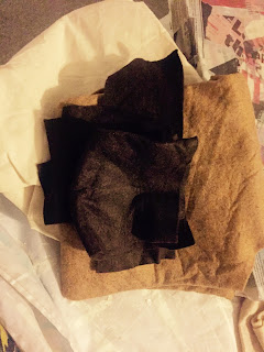
 Here are some felts I had from my last project. I thought about these that I had left, and becuase my team members were doing the puppets using a felting method, this would be good to have the set also in rough felt. Yet this is not the right kind, and getting the correct material wouldn't be possible on our budget. Even though this would have looked really might, this wasn't possible for this project, but it is something to try in the future.
These are some closeups from the materials I have for this project. Now I will go onto building the sets when I can make sure I have everything and I know how big my teammates puppets will be as this will change how the set's size will be determined. 


One of our team members owns some diggers, so I also need to know the size of them so the larger set can also be built better.


Responsive Collaborative- Submitting

Responsive Collaborative- 

Submitting

When submitting to YCN for this brief, we were all there to help submit our work. For submission, we needed a proposal, a short paragraph about why were were doing what we were doing and why we chose the BEAR brief.
This is the proposal we attached with our work:

OUR BEAR PROPOSAL

For BEAR, we wanted to do something a bit different. Fear is something you often try to avoid talking about with children, but it is such a fundamental part of life and development. We wanted to create a set of cards, showing how fear doesn’t have to be too scary. I think children will also find comfort in knowing that they’re not alone in their fear. Fun facts and jokes to make the fears not seem so scary anymore, making children more confident and able to overcome things.
Kids will be able to collect stickers to add to their BEAR poster, giving BEAR his ‘armour’ and able to join him fight against fears. We want kids to know that it’s okay to have fears, and give them confidence that they can overcome it.

AMY, BETH, LIZZY

When going online to submit, we followed the instructions they provided. They told us we needed to sign up/login, ZIP all of the files and say a brief statement of why we have chosen this brief.
Here one of the girls in the team chose to sign up in her name. After it asks for any other members so all of our names are still mentioned in the long run. This was a simple step so didn't take long to do at all, which I was worried about as the other site D&AD crashed when people tried to upload so we were glad this didn't happen.

 Here is a message that popped up as we pressed enter with all of our files attached. After submitting, they have said we will recieve a confirmation email telling us whether or not it went ok, but also just letting us have an email of confirmation.

 Here is the email we received. They have given confirmation on our submission and that it arrived and was a correct submission.
I am very happy this project is over now as it was extremely stressful and complicated working with head strong people. It was however, very interesting to take part in as I have learned new skills, new amounts of patience and a new understanding of  Illustration. If I were to do another project however, I wouldn't let my designs be overlooked like they kept being this time, I wont just back down becuase they feel their ideas are better. So this is something I hope to do in the 3rd year to have more of an authority within a team, like a team leader. 

Wednesday, 29 March 2017

Responsive- Loopdeloop Chicken Animation

Responsive- 

Loopdeloop Chicken Animation 

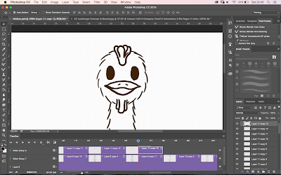
When sketching and getting my animation together, I needed to distinguish the colour of the feet so it was easier to understand, so I coloured one leg red, so I could be sure which foot had been in front of the last. At this point, I was still trying to do more work on in-betweens so my chickens body flowed more smoothly.
 As I was adding in details, I added in the facial features and smoothed out the lines so they weren't basic sketches. This helped me to see any mistakes or lines that didn't work.
 When adding colour, I started with the feet so I could see the colour on them to try and work out if the legs are working in a walking motion.
 This is the fully coloured chicken. He looks a lot better in colour as I can see him more clearly and understand his motions better, but he looks how I envisioned him to look for the start so I am happy with the outcome.

This is a clip of the rough animation currently, but I am not happy with the background as it doesnt look like he is moving properly. As I am running out of time, a basic background is what I will need to do but if I had a lot of time, I would do a rounded base coming away from the screen to add depth and make it look like the chicken is constantly walking towards the screen and over a hill.
Here was another idea a peer gave me, as I was designing a sassy walk, he could be coming down a catwalk for chickens and add more of a comedy element to the animation. This would take too long as I would have to work out how to loop the animation but I will have to leave this idea and maybe come back to it in the future.

This is the final animation of a looping walk cycle of my chicken, the background is basic and it concentrates more on his walking and shows a lot of motion from the body. I am happy with how he turned out as I didn't have a lot of time, becuase of other projects, to complete him. Yet I am incredibly happy I did finish it.

This is the box to submit the animation on Loopdeloop. As I have submitted this year already, I knew what I needed to do so this didn't take to long to do. As it is a gif, I needed to put it on Tumblr first as they need to know it isn't too big, but this was easy and also didn't take much time.
This is just a screenshot from completion saying thank you for submitting.


Monday, 27 March 2017

Responsive Collaboration- Layout Progression- Completing

Layout Progression- Completing

This is the final design of the packet, poster and banner. These are all for gaining interest of children by bringing in digital elements as this is what that generation is used to. This poster will keep their attention. I have written on the poster 'Im here to protect you from your fears! Collect cards to find my armour, as I appear to have lost it in my travels!'  This lets children know they dont have to be afraid, as well as that BEAR is here to help. While also adding in the collective stickers for them to collect.
Below are all of the final cards for this project that we are going to hand in in a few days. I am very proud of how they turned out. I have learned a lot being in this collective, the struggles, the stress and what I am capable of doing under pressure. If we were to win, we have many more ideas for these cards as their are so many different fears that children posses.


Sunday, 26 March 2017

Responsive Collaboration- Final Designs and Pages

Final Designs and Pages

When the team member who did the characters gave me the designs, she hadn't done the backgrounds yet. This was when I tested the character on the cards, as I was seeing if she even needed to do them. Although after looking at the characters, they dont look right without their background behind them as they look too empty and out of place. I sent these to the girls and they agreed that they didn't quite look right.
These are what the cards look like at this point. 
As we wanted to go further with making our cards collectable. I decided to do a poster. This poster will be letting children collect stickers with each card, where they can scan a barcode and go to the poster online with new stickers each time to add. Here I have drawn the packet of one of BEARs products. This is the back of the packet. I have added their original symbol as this would be their outside packet, that we will not change.

Apart from at the lower half of the back. I have added the BEAR of our design in his helmet, as well as a barcode. One, a child could scan with their parents and go to the poster to place his armour on and find more armour, from other cards.
I am adding smaller elements from the cards as to keep the overall theme going, and fill out the poster so it doesn't look blank, boring and plain. I wanted to keep it fun for the children who would be wanting the poster.
On the back of the cards will be the title in large letters. This is so children can understand what the cards are about and wont be confused about the information they are receiving.

I have also added in a gold metal pole for the banner on the upper right. This will have information on where to find the poster. It will also have individual colours for each card.
These are the banners for the website that follows the barcode to the same location. Each one is a different colour, that are bright and colourful. This also furthers their individuality and makes them more collectable.
Here are 4 examples of the colours I have chosen, while making them more pastel tones as the other ones before I tried, were too harsh with the theme we have.
When making the cards and getting to the final designs, I wanted to check the sizes as the cards are smaller than I thought when I was researching. This is the size of the cards on an A4 paper. I used this when building the cards, as it helped me to figure out the size of images, text and elements on the packet.

Responsive Collaboration- Layout Progression- Adding More Detail

Layout Progression- Adding More Detail

This week was spent laying out more of the detail from within the cards, like text, BEAR and smaller elements. This image below, is where I left off. As you can see, there are still many things to add and design so I will be working hard to get much more of the cards base down for the template.
As one of the other girls in our team is doing the characters and backgrounds, they needed the size of the box, they needed to fill. This was the basic shape they would need to have filled so I sent them the approximate size. This means they are producing the work needed for us to complete this project in time so I hope they can have them done quick as it is very stressful working in a team you cant talk to and might not get along with if work doesn't go well.
This is the character with their background on the canvas background. I am having to make it smaller and change my background as it goes over the edges, but it also covers the nails, so I will swap these over so the nails are on top. This way it will really look like the image was placed on top and pinned on a board.
This is the text one of the girls within the team created, they didn't like the text I produced so decided to do it and I add it in. This wasn't that much of a surprise as Typography has never been one of my strong points. As long as the cards look as good as we can make them, it will be a good result. This box is to show the real name of the phobia. As the cards are for 4-9 year olds, saying the words seemed like it would be very useful, below the word you can read the pronunciation of how they can say each section of the word. This also aids the educational element of the cards.
This is BEAR. The main character for the cards. We have done more than most have done for the cards in the past as they said BEAR needs to be the main character, so we have added him to the front and the back. This shows we understand the brief BEAR has given us. I have placed the character so it looks like he is talking and speaking the interesting facts the the children. This also makes the character more fun for the children when receiving facts and information as they normally think of this as boring, as it is learning.


This is on the back of the card. The facts are in the bottom box, being spoken by BEAR and the armour box above is showing jokes to make the audience laugh. One of the girls within the team looked up the facts, whereas I researched the jokes. There will be one joke per card and 2 facts.

These are all of the jokes I found about each of the topics and fears we have found.
This is a closeup of the quill and ink pot. These are a small element on the card to further the theme we created. It took me a while to do the quill as I couldn't get the look right but I am very happy and proud of how it turned out.


Numbering the cards was made very clear to BEAR as being important as it makes the cards collectable. Here I have added a number to the scroll but after looking at it from a distance, it looked too bold and I wanted it to seem like it had been written on the scroll not placed on. This is why I redid the writing in a paler colour to blend in more.
This is the text that looks better than the one I did above as it looks like it belongs on the card instead of added on after.

Responsive Collaboration- New designs and Theme Development

New Design and Theme Development

When discussing the theme, my team didn't think it was involved enough in the overall look of the cards. This was when we went all out and made the cards look like they were medieval and like the walls and armour they had in those times.
Our logo will be held by the BEAR bear as they wanted the cards to show his journey and his path to overcome fear. To fill in the blanks on the cards, I will add in ink splatters and ink pots with a quill so the overall card looks full and filled with facts and information for the children.
This is a closeup the character designer of our group has drawn so when the facts are within a box, he can be telling the children the facts and talking to the audience which will engage children with what is being said.
Now that my team is more happy with the design I will go ahead and do these cards. Yet I have been struggling to keep them happy with what is being done so this may be something I need to work on, as I have a confidence issue and with saying no. This is leading to more of my creativity being silenced, which isn't good so this is something I am changing when doing these last cards, they will be designs that, Me as the layout artist am happy about and they said they were when they saw them so cannot change anything. If they do, I will not have time to go back and change them again becuase of time so these will be the final layouts.

Responsive Collaboration- Critique and Changes made

Critique and Changes made

This is a page where I added all of the characters one of the members of our group has done, as she is in charge of characters. She has been very difficult to work with though as she doesn't do much work in her own time for this. All of this work was done when we were next to her so this has been difficult to manage with our time constraints, but when she does draw, the designs are really good and work well with the themes we have chosen.

 These two images below are from when I was adding these characters into the card layout. As the other team member wants to do colour, I have not lined these designs or added any colour as this can be added in her stage if there is enough time left. These cards are for the clown theme and the spider theme as BEAR didn't want cute so we haven't tried to make everything overly friendly, as this isn't how the company want them to come across.
 These are 3 of the card designs showing the themes of clowns, dogs and spiders, as these are the designs I was given but she hasn't finished the other two designs yet. I have added more detail to these designs, like the titles in rough, the card numbers, fact sections and a fear'o' meter, to add in some creativity to the designs. From these designs, they look creative and you can tell they are from the BEAR brand.

From the first designs of the cards, my team members told me to change the designs as there were too many straight lines. This was done as I thought, as illustration students, they would prefer this but it was an easy change to make, so this is when I added the characters to see what they looked like and the next day showed my team.

Intrim Critique

After showing my team, it became clear they weren't very organised with their plan. They had completely changed the ideas and themes as they are both from Illustration and I wasn't during their lessons every other day. This was annoying as it became like working with a client, where their ideas are more important than yours and they keep changing their minds. I did agree with some of their comments as they mentioned that the fear'o' meter was like another card, which I had not seen but was something the BEAR company had used similar to so this was easy to change. The theme we are also trying to show is about protecting children with armour, so this is something that can be enhanced and made more clear with more references to armour, shields and old worldly designs.

From the crits with other groups, we got feedback on how to show the collectable element, as we were struggling to place the sticker, so they suggested  using a bar code and having the poster as a separate print of that they could collect the armour for over time.

This made it clear we need to get more work done and work together more as I dont want to have to waste too much time just re-doing designs because one of the group members is very pushy. This is why I know I need to stand up for what I have done and my designs in the future.